Understanding backorder vs out of stock is essential for any ecommerce merchant facing inventory gaps. Stockouts cost retailers $1.2 trillion globally every year in direct lost sales alone. When customers land on a product page and can’t buy what they want, the consequences ripple through your revenue, customer loyalty and brand perception.
But there’s more than one way to handle out of stock ecommerce situations. You can mark products as “out of stock” and block purchases entirely. You can accept backorders and let customers buy now for later delivery. Or you can take a third approach that some merchants overlook: pre-orders.
Understanding the difference between backorder vs out of stock (and knowing when each makes sense) can mean the difference between capturing revenue and losing customers to competitors. By the end of this guide, you’ll know exactly which approach fits your situation.
What Does Backorder Mean? Understanding Backorder Meaning
So what does backorder mean exactly? A backorder happens when a product is temporarily unavailable but customers can still purchase it. The backorder meaning is simple: the item isn’t in your warehouse right now, but you’ve confirmed that more inventory is coming. Customers place their order, you take payment (or vault their card), and you ship once stock arrives.
Think of backorders as a promise: “We don’t have it today, but we will soon, and we’re holding your spot.”
The key characteristics of a backorder:
Customers can still purchase the product despite zero inventory
Restocking is confirmed with a known or estimated timeline
Payment is typically collected upfront or at time of shipment
Fulfillment is delayed until inventory is replenished
Backorders usually work best for short restocking windows. On average, it takes 14-21 days to fulfill a backorder, though this varies by product and supply chain. The shorter the window, the more willing customers are to wait.
From an operational perspective, backorders let you continue taking orders rather than turning customers away. But they also create fulfillment complexity. You need systems to track incoming inventory, manage customer expectations, and process payments at the right time.
What Does Out of Stock Mean?
When a product is marked “out of stock,” customers cannot purchase it at all. The buy button is disabled, replaced with a “Sold Out” badge, or the product may be hidden from your store entirely.
An out-of-stock status signals uncertainty. Unlike backorders, there’s no guarantee the product will return, and no commitment to a timeline. Customers have to wait and hope, or look elsewhere.
The key characteristics of out of stock:
Customers cannot purchase the product
Restocking timeline is unknown or uncertain
No payment is collected
The product may or may not return
Out of stock is the default setting for most ecommerce platforms when inventory hits zero. It’s the safest approach from a fulfillment standpoint because you’re not making promises you can’t keep. But it’s also the most expensive from a revenue standpoint.
Key Differences Between Backorder and Out of Stock
The fundamental difference comes down to purchase availability and customer commitment. Here’s how they compare:
Factor
Backorder
Out of Stock
Can customers purchase?
Yes, with delayed fulfillment
No, purchase blocked
Restocking timeline
Confirmed or estimated
Unknown or indefinite
Payment timing
Upfront or deferred
None
Customer expectation
“My order is coming soon”
“Maybe it will come back”
Revenue impact
Preserved (delayed)
Lost
Operational complexity
Higher
Lower
From a customer psychology perspective, the difference is significant. A backorder customer has made a commitment. They’ve decided to buy, entered their payment details and are waiting for delivery. An out-of-stock customer hasn’t committed to anything. They’re still in consideration mode and can easily be distracted by a competitor.
This psychological difference matters for your business. Customers who have already committed are less likely to cancel or shop around. But backorder customers also have higher expectations. They expect clear communication, accurate timelines and a smooth delivery experience.
When to Use Backorders
Backorders work best in specific scenarios where you have confidence in your restocking timeline and customers are willing to wait.
Fast-moving bestsellers
When a popular product sells out faster than expected, backorders let you continue capturing demand. If you have a reliable supplier and predictable restocking timeline, accepting backorders keeps sales flowing while you wait for the next shipment.
Core catalog items
For products that are a permanent part of your catalog, backorders make sense during temporary stockouts. These are items you’ll definitely restock, and customers know they’re getting a product that’s proven and available.
Short restocking windows
Backorders work best when the wait time is measured in days or weeks, not months. The sweet spot is typically 2-6 weeks. Beyond that, customer patience wears thin and cancellation risk increases.
Reliable supplier relationships
Only offer backorders when you’re confident in your restocking timeline. If your supply chain is unpredictable, making promises you can’t keep will damage customer trust more than simply saying “out of stock.”
When NOT to use backorders:
Seasonal items unlikely to restock this season
Products with uncertain supply chains
Wait times beyond 8-12 weeks
Items being discontinued or phased out
The risk with backorders is overpromising. If you tell customers their order will ship in two weeks and it takes six, you’ve created a support headache and potentially lost their trust for future purchases.
When to Mark Products Out of Stock
Sometimes the safest approach is to be upfront: this product isn’t available, and you can’t make promises about when it will return.
Discontinued products
If you’re not bringing a product back, don’t pretend otherwise. Mark it out of stock (or redirect to an alternative) and move on. Accepting backorders for discontinued items is a recipe for refunds and complaints.
Uncertain restocking timelines
When you genuinely don’t know when inventory will arrive, it’s better to be honest. Telling customers “out of stock” is more trustworthy than making up a timeline you can’t guarantee.
Supply chain disruptions
Major supply chain issues can make restocking timelines impossible to predict. During periods of uncertainty, marking products out of stock protects both customer expectations and your operations team.
Quality or compliance issues
If a product is unavailable due to quality concerns or regulatory issues, you need to resolve those before selling again. Out of stock is the appropriate status while you work through the problem.
The downside of out of stock is lost revenue. But the upside is operational simplicity and honest customer communication. Sometimes it’s better to lose a sale today than damage trust with a broken promise.
For Shopify merchants dealing with stockouts, we’ve written a comprehensive guide on what to do when products are out of stock on Shopify, covering strategies from hiding products to setting up notifications. Understanding Shopify backorder functionality is crucial for maintaining sales during inventory gaps.
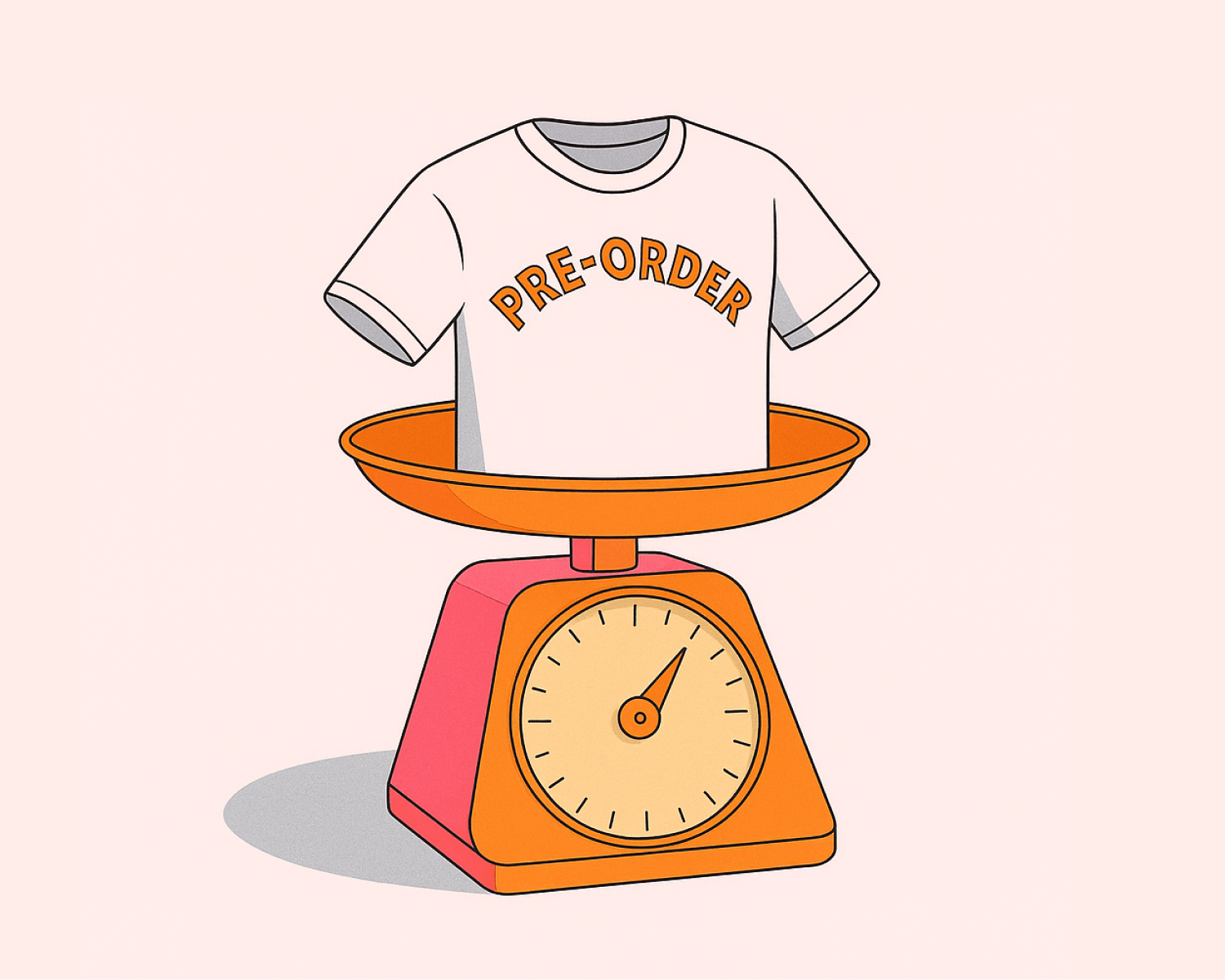
The Third Option: Preorder vs Backorder
Here’s where most backorder vs out of stock discussions fall short. They treat these as the only two options when there’s a third approach that often works better for ecommerce: pre-orders.
Understanding preorder vs backorder differences is crucial for choosing the right strategy. Pre-orders are different from backorders in a few important ways:
Proactive vs reactive: Pre-orders are typically used for new products or planned restocks, while backorders are reactive responses to unexpected stockouts
Longer acceptable timeframes: Customers willingly wait months for pre-orders but lose patience after a few weeks with backorders
Different psychology: Pre-order customers are excited early adopters; backorder customers are frustrated buyers whose item wasn’t available
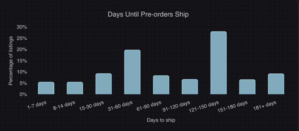
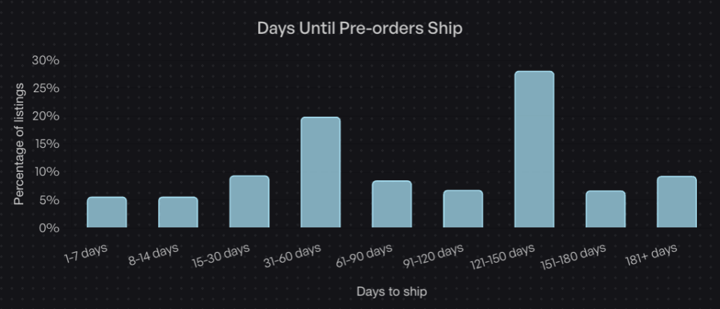
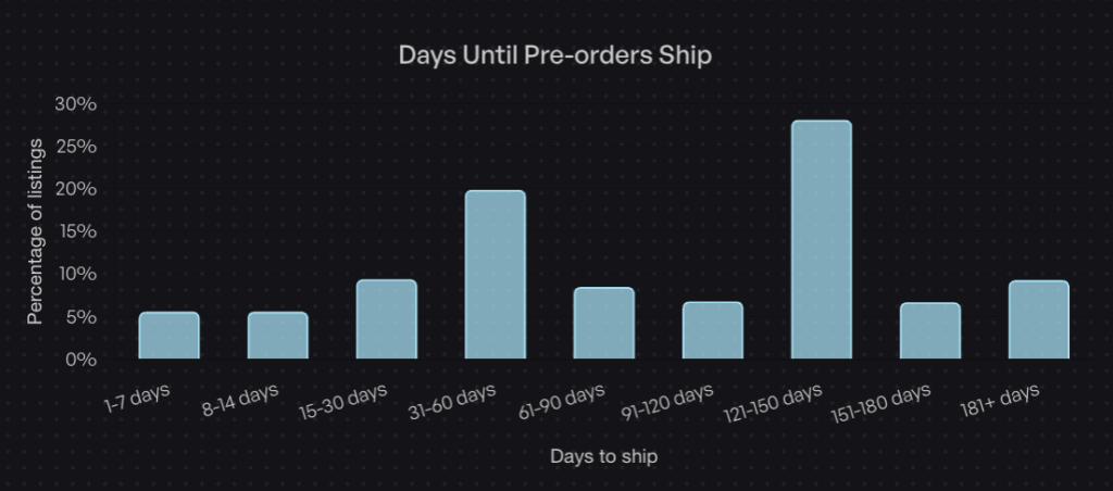
The data backs this up. According to our analysis of over one million pre-orders generating $85M+ in revenue, the most common pre-order shipping timeframe is 121-150 days. That’s 4-5 months. Customers don’t just tolerate these wait times, they expect them.
The average pre-order cancellation rate? Just 5.4%. Despite wait times that would be unacceptable for a backorder, pre-order customers stay committed because they’ve made a conscious choice to wait for something they want.
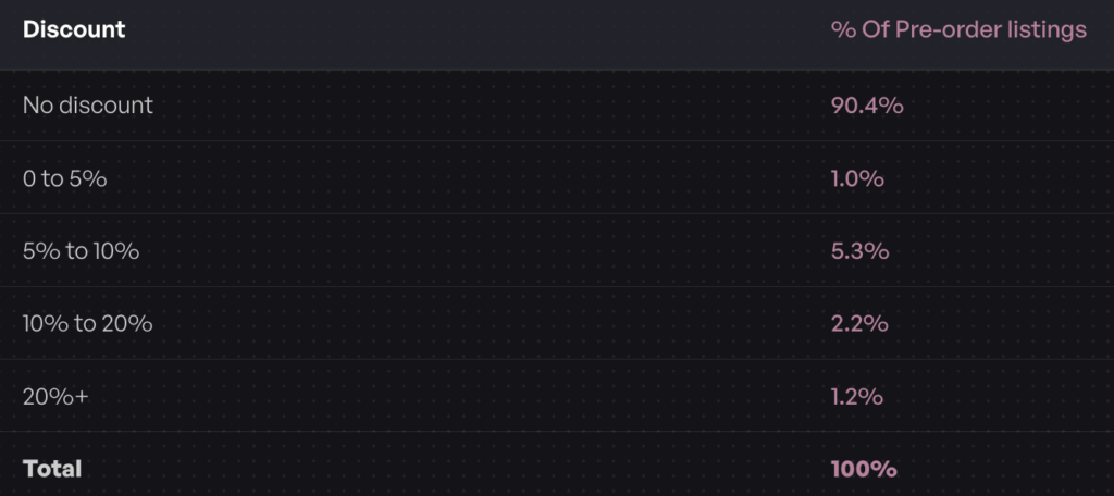
Another insight: 90.4% of pre-orders carry no discount. Customers aren’t waiting because they got a deal. They’re waiting because they want early access to the product. This is fundamentally different psychology than a backorder, where customers often feel they’re being inconvenienced.
When pre-orders work better than backorders:
New product launches (build anticipation before inventory arrives)
Restocks with longer lead times (4+ weeks)
Made-to-order or custom products
Limited edition drops (create scarcity and urgency)
Seasonal products returning next season
Pre-orders also give you payment flexibility that backorders typically don’t. With charge-later pre-orders, you can vault a customer’s card at checkout and charge when you’re ready to ship. This reduces refund risk for longer timelines while still capturing customer commitment.
With three options available, how do you decide which approach fits your situation? Here’s a decision framework based on the most common backorder vs out of stock scenarios:
Scenario
Best Approach
Why
Known restock date (2-4 weeks)
Backorder
Short wait, high confidence, keep sales flowing
Known restock date (4-12 weeks)
Pre-order with charge-later
Longer wait needs proper expectation-setting
Unknown restock timeline
Back-in-stock notification
Don’t make promises you can’t keep
New product launch
Pre-order
Build anticipation, capture early demand
Seasonal product (returning later)
Pre-order or notification
Depends on how far out the restock is
Product being discontinued
Out of stock + redirect
Don’t accept orders you can’t fulfill
Made-to-order items
Pre-order with deposit
Collect commitment before production
High-ticket items
Pre-order with deposit
Reduce risk for both parties
The key questions to ask:
How confident are you in the restock timeline? High confidence = backorder or pre-order. Low confidence = out of stock or notification.
How long will customers wait? Under 4 weeks = backorder probably works. Over 4 weeks = consider pre-orders with proper messaging.
Is this a new launch or a restock? New launches benefit from pre-order anticipation. Restocks can go either way.
What’s the price point? Higher-ticket items may warrant deposit-based pre-orders to secure customer commitment.
How will this affect your operations? Backorders and pre-orders both require systems to track orders, manage fulfillment holds and communicate with customers.
Best Practices for Shopify Backorder and Out of Stock Management
Regardless of which approach you choose, clear communication is essential. Customers can handle waiting. What they can’t handle is uncertainty. Here are best practices for managing backorder vs out of stock situations in your store.
Set expectations on the product page
Don’t bury the shipping timeline in fine print. If an item is on backorder or pre-order, make the expected delivery date prominent. “Ships in 2-3 weeks” or “Expected ship date: April 15” gives customers the information they need to decide.
Use dedicated buttons and messaging
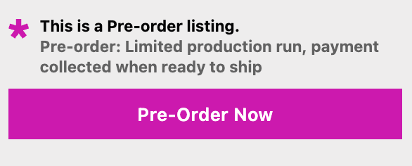
A generic “Add to Cart” button doesn’t tell customers they’re committing to a delayed order. Use clear labels like “Pre-order Now” or “Backorder” to signal that this isn’t a standard purchase.
Send automated updates
Keep customers informed throughout the wait. A simple “Your order is still on track to ship next week” email can prevent support tickets and build trust. If timelines change, communicate proactively.
Consider payment timing carefully
For short backorders, charging upfront is usually fine. For longer waits (especially 30+ days), consider charge-later options where you vault the customer’s card and charge closer to shipment. This reduces refund requests and expired card issues.
The best backorder strategy is avoiding backorders in the first place. Use inventory forecasting tools and pre-order inventory management to predict demand and set reorder points that give you buffer before running out.
Don’t overcommit
If you’re not sure how much inventory you’ll receive, consider capping backorders or pre-orders to avoid overselling. It’s better to turn away some orders than to cancel orders after customers have committed.
Putting It All Together: Backorder vs Out of Stock
The backorder vs out of stock decision isn’t just about definitions. It’s about choosing the right tool for your specific out of stock ecommerce situation.
Backorders keep sales flowing during short, predictable stockouts. They work best when you have confidence in your restocking timeline and customers are willing to wait a few weeks.
Out of stock is the honest approach when you can’t make promises. It protects customer trust and operational simplicity, even though it means lost sales in the short term.
Pre-orders offer a third path that many merchants overlook. When comparing preorder vs backorder options, pre-orders handle longer timelines, build anticipation for new products and give you payment flexibility that backorders don’t. For most ecommerce scenarios beyond simple restocks, Shopify pre-orders are worth considering.
The common thread across all three approaches? Communication. Customers can handle delays when they know what to expect. What they can’t handle is uncertainty, broken promises or radio silence.
If you’re running a Shopify store and want to explore pre-orders as an alternative to Shopify backorder management, our guide on how to do pre-orders on Shopify covers the full setup process. And for managing inventory across pre-orders and regular stock, see our guide on managing pre-order inventory in Shopify.
Whatever approach you choose, the goal is the same: capture demand, keep customers informed and deliver on your promises.
A pre-order landing page is your first impression for an upcoming product. Get it right, and you’ll build a list of eager customers ready to buy. Get it wrong, and you’ll struggle to generate interest, even if your product is great.
Prefer to watch a video? Click here to see Oli go through the 20 landing-page strategies.
Most brands copy generic templates without understanding what actually drives conversions. They focus on flashy design while missing the fundamentals: clear product information, payment flexibility, and trust-building elements that reduce buyer hesitation.
We’ve analyzed over $92.7 million in pre-order revenue across 1.13 million pre-orders to understand what works. In this guide, we’ll break down 11 best pre-order landing page examples across different industries, showing you exactly what makes them convert and how you can apply these tactics to your own pre-order campaigns. These pre-order strategy lessons come from analyzing real merchant data.
Whether you’re launching a new product or testing demand before committing to inventory, these examples will show you how successful brands structure their pre-order pages to maximize conversions.
What Makes a Great Pre-Order Landing Page
Before diving into examples, let’s establish the core elements that separate high-converting pre-order landing pages from generic product pages.
Clear Product Information
Your visitors need to understand exactly what they’re pre-ordering. This means high-quality visuals including hero images, product renders, photos, videos, and GIFs that showcase your product from multiple angles. Product renders with close-ups work particularly well for showing attention to detail.
Transparency matters. Include specific shipping timelines, not vague promises. “Ships March 2026” beats “Ships Q1” every time. Detail your specifications and features so customers know exactly what they’re getting.
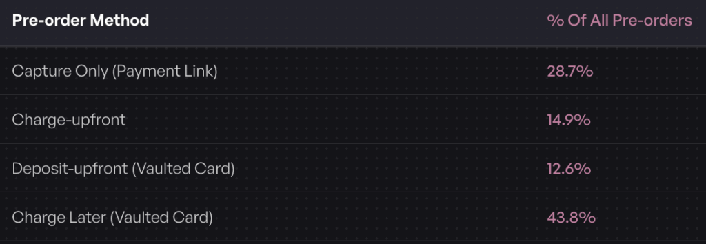
Payment Flexibility
How you charge matters more than most brands realize. Our data shows that 43.8% of pre-order listings use charge-later methods, where customers provide payment details but aren’t charged until the product ships. This significantly reduces friction for long lead times.
For higher-ticket items, deposit or installment plans work well. Let customers pay a portion upfront, then automatically collect the balance when you’re ready to ship. Consider offering tiered pricing options or the ability to pay early for additional benefits like free shipping.
Trust and Risk Reduction
Pre-orders require trust. Customers are paying for something they can’t hold yet. Reduce this risk with social proof including testimonials, backer counts, waitlist numbers, and user-generated content videos. Celebrity and media endorsements add credibility. If your product has attracted venture capital or significant backer funding, mention it.
Clear refund and cancellation policies are essential. Don’t bury these details. Our data shows an average cancellation rate of only 5.4% when merchants communicate clearly and offer flexible payment options.
Include a comprehensive FAQ section addressing common concerns about delays, changes, and refunds. Answer objections before they arise.
Urgency and Scarcity
Limited quantity messaging creates fear of missing out. Countdown timers, early-bird discount windows, and limited edition messaging all drive urgency. Just make sure these tactics are genuine. Fake scarcity damages trust.
Strong Call-to-Action
Your CTA should be specific. Don’t use generic “Buy Now” buttons. Use “Reserve Your Spot,” “Pre-Order Now,” or “Beat the Queue” to create more compelling copy that matches the pre-order context.
Make your CTA prominent with oversized buttons optimized for mobile. Use sticky CTAs that remain visible as users scroll. If you’re offering deposits, show the deposit amount clearly. Include messaging like “Won’t be charged until ships” to reduce purchase anxiety.
11 Best Pre-Order Landing Page Examples
Let’s look at real examples across different industries, breaking down what makes each one effective.
Food and Beverage
Mila: DTC Dumplings and Noodles
Mila’s pre-order page for their Holidays Bundle demonstrates how food brands can create appetite appeal through visual design and smart merchandising.
What works:
Bundle offer: Packaging products together increases average order value while solving the “what should I order” decision fatigue
Free gifts related to the product: Bonus items create perceived value without cutting into margins significantly
Bold brand colors: Strong visual identity makes the page memorable and reinforces brand positioning
Media endorsements: Press mentions build credibility and trust for newer brands
High-quality product photos with appetite appeal: Food photography that makes you want to eat right now
Onomatopoeia in headlines: “Sip, Slurp and…” creates a sense of movement and action that engages visitors
The page succeeds because it doesn’t just show food, it makes you crave it. The bundling strategy also addresses a common pre-order concern: “Is this worth it?” By including free gifts and creating a complete meal experience, Mila answers that question before it’s asked.
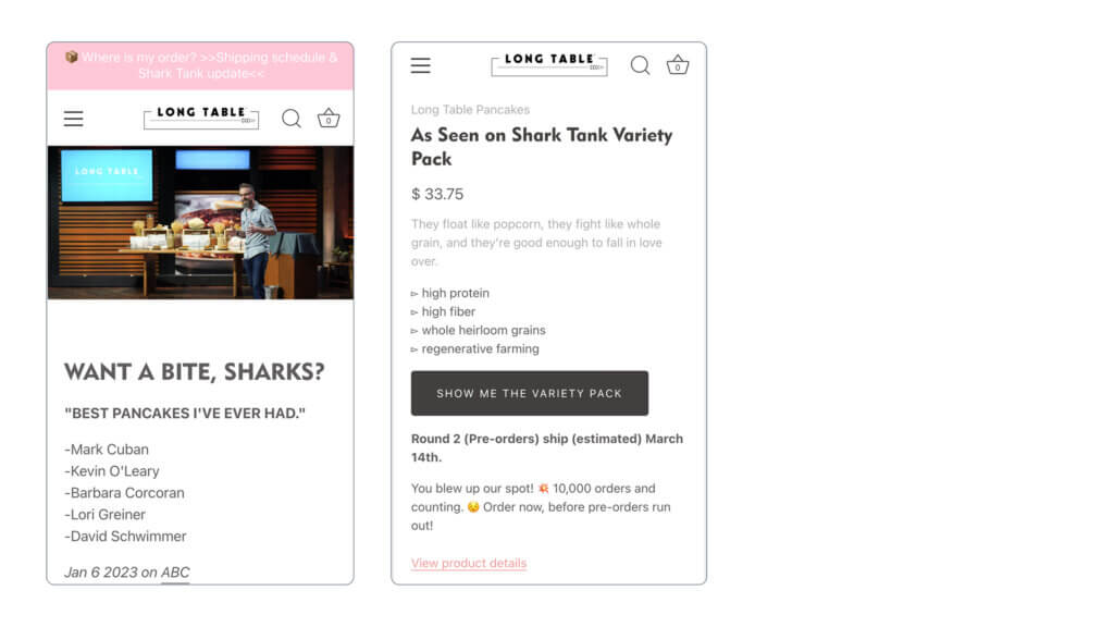
Long Table Pancakes
Long Table Pancakes leveraged a Shark Tank appearance to create massive pre-order momentum with a landing page built around celebrity validation.
What works:
Celebrity endorsement from Shark Tank: Appearing on national television provides instant credibility and social proof
Shark Tank specific offer: Creating a time-sensitive offer tied to the air date captures the spike in search traffic and interest
This example shows how external validation can carry a pre-order page. If you’ve received press coverage, awards, or celebrity endorsements, feature them prominently. The timing of their offer to coincide with their TV appearance is equally important, capturing interest while it peaks.
Travel and Lifestyle
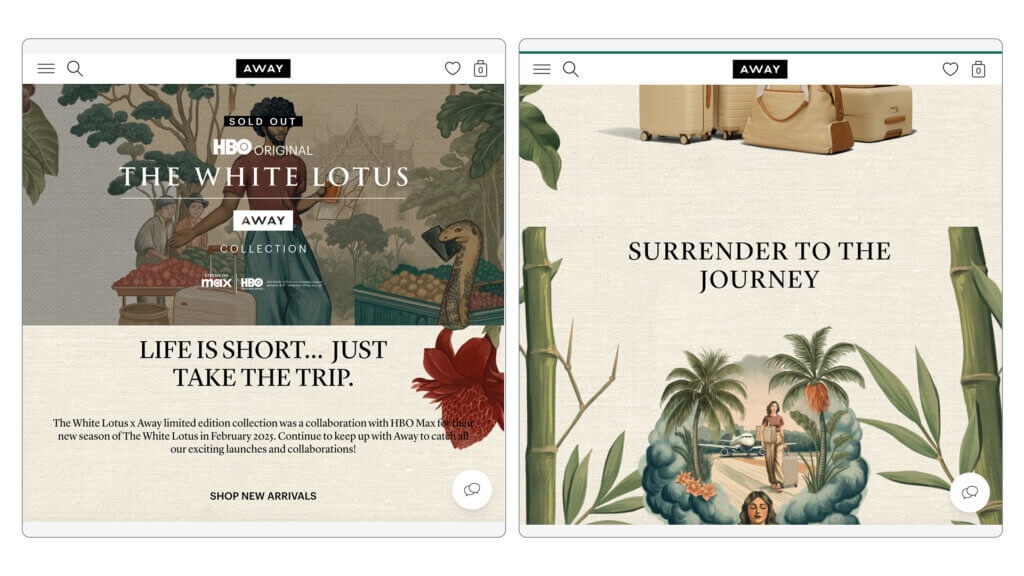
Away: ‘The White Lotus’ Collection
Away’s collaboration collection demonstrates how pop culture partnerships can create pre-order excitement beyond just product specs.
What works:
Pop culture references: Tapping into existing fandoms brings built-in audiences
Design and illustrations in the style of ‘The White Lotus’: Visual cohesion between the show’s aesthetic and the product line
On-scroll animations: Interactive elements keep visitors engaged as they learn more
Away understands that they’re not just selling luggage, they’re selling an aspirational lifestyle. By partnering with a popular show and mirroring its visual language, they create an emotional connection that goes beyond product features.
Beauty and Personal Care
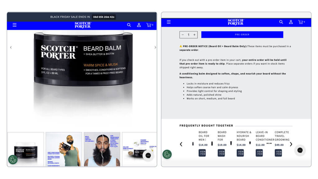
Scotch Porter: Beard Balm
Scotch Porter’s pre-order page for beard care products focuses on before-and-after results and natural ingredients, addressing the two main concerns of their target audience.
What works:
Big product imagery: Large visuals make the product feel premium and substantial
Benefits highlighted at the top showing extreme before-and-after results plus natural ingredients: Immediately answering “will this work for me?” and “is it safe?”
Clear pre-order button with terms: No confusion about what happens when you click
“Frequently bought together” section: Increases AOV by suggesting complementary products
The genius here is in the prioritization. Benefits come first, then product details. This page understands that customers care more about results than ingredient lists, so it leads with transformation.
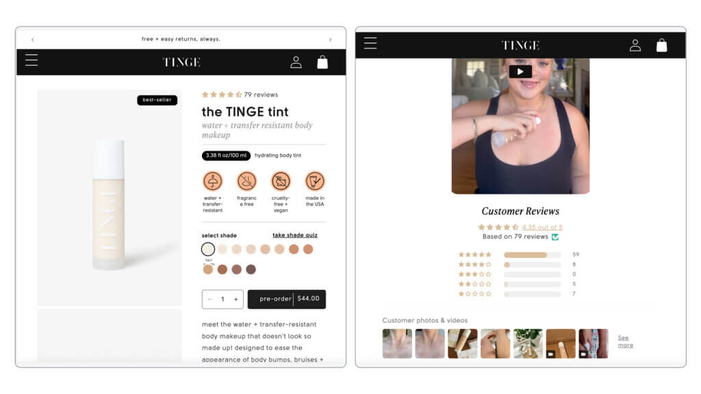
Tinge Beauty: Tinge Tint Body Makeup
Tinge Beauty’s approach combines social proof with low-friction shopping through strategic design elements.
What works:
Benefits at the top with iconography: Visual cues make information scannable
Sticky CTA and benefits area: Key information remains visible throughout scrolling
Social proof through UGC videos and reviews: Real customers using the product build trust
“Free and easy returns” in top bar: Immediately addressing the “what if it doesn’t work” concern
The sticky elements are particularly effective for mobile users who might scroll through lots of content. By keeping the CTA and key benefits visible, Tinge reduces the friction of finding the buy button again.
Home Goods and Furniture
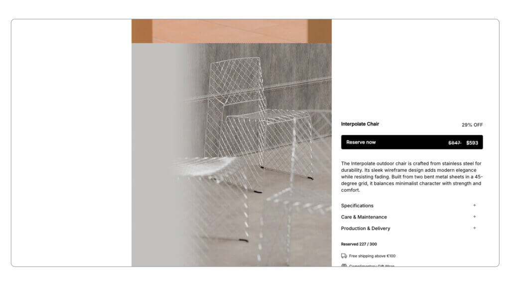
Matias Moellenbach: Interpolate Chair
High-end furniture requires a different approach, emphasizing craftsmanship and in-context visualization.
What works:
High-quality, in-context product photos: Showing the chair in real spaces helps customers visualize it in their homes
Sticky buy button for ease of purchase: Always visible on mobile
“Reserve now” for less commitment-heavy language: Reduces psychological friction compared to “buy”
For expensive items like furniture, reducing commitment language helps. “Reserve” feels less final than “purchase,” even though it accomplishes the same goal. The in-context photography is crucial because furniture is about how it fits into your life, not just what it looks like in isolation.
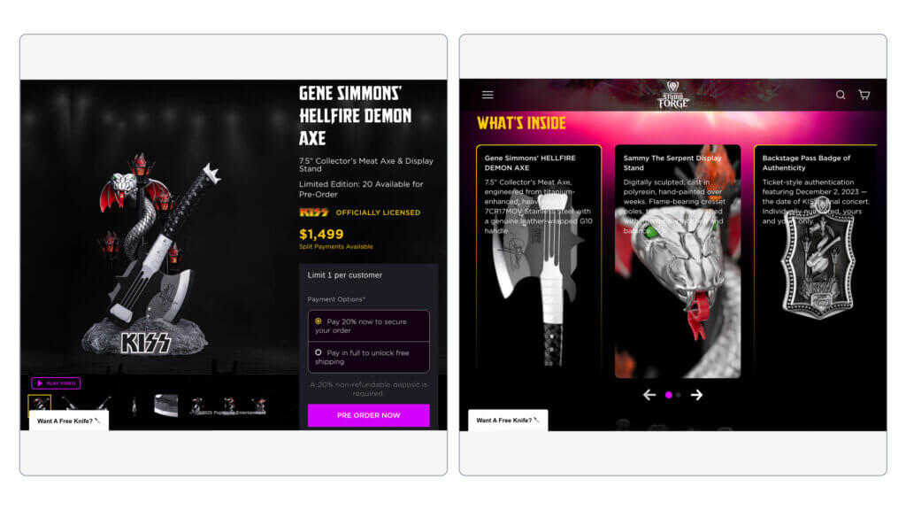
Dalstrong: ‘GENE SIMMONS’ HELLFIRE DEMON Axe
Dalstrong’s celebrity collaboration demonstrates advanced payment flexibility for high-ticket items.
What works:
Celebrity endorsement from Gene Simmons: Rock star credibility for a premium product
Deposit upfront to secure higher purchase price: Makes a $500+ item more accessible
Option to ‘pay early’ to unlock free shipping: Creates incentive for faster payment
3D product renders with close-ups: Shows off attention to detail and craftsmanship
The payment flexibility here is key. By offering a deposit option, Dalstrong makes their high-ticket item accessible to more customers. The pay-early incentive is clever, rewarding customers who can afford to pay sooner without penalizing those who need the payment plan.
Apparel and Accessories
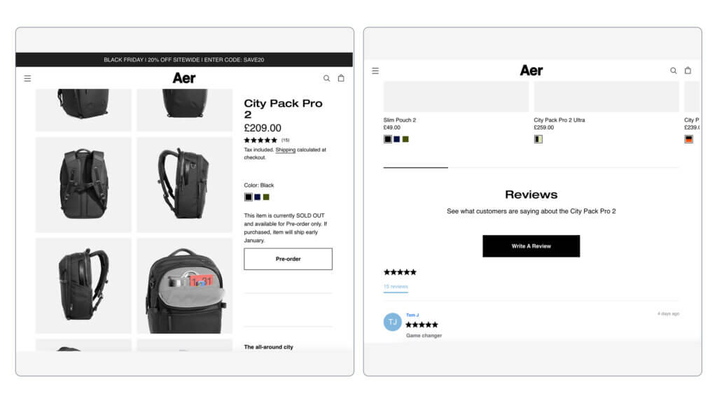
Aer: City Pack Pro Rucksack
Aer’s pre-order page for their technical backpack focuses on function and social proof.
What works:
High-quality product photos: Multiple angles and use cases
Sticky pre-order button: Always accessible on mobile
Upsells section: Suggests related items to increase AOV
Reviews section for social proof: Real customer experiences build trust
For functional products like backpacks, customers want to see the product in action. Aer delivers with photos showing the pack being worn, packed, and used in different contexts. The reviews section is positioned early to address quality concerns before they become objections.
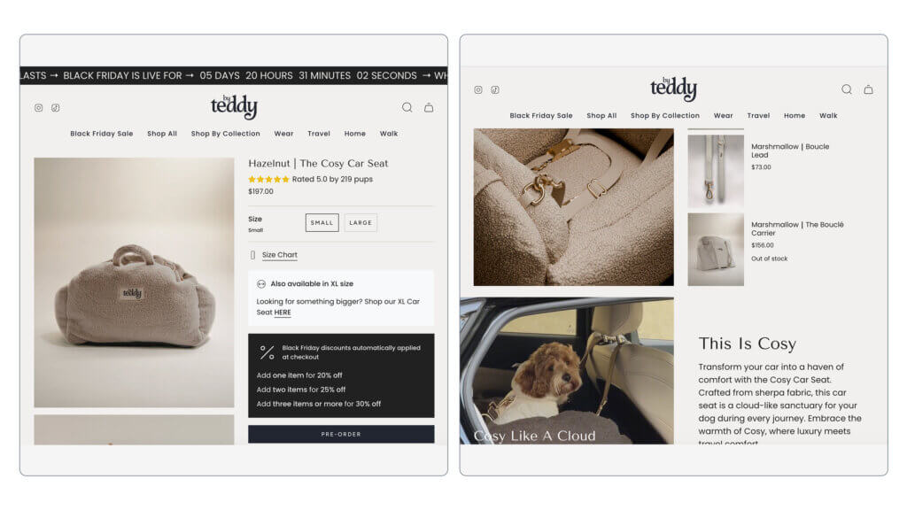
By Teddy: Dog Car Seat
By Teddy’s approach combines bundle pricing with sticky CTAs optimized for mobile shopping.
What works:
Sticky CTA area: Button remains visible throughout the page
Bundle pricing: Encourages customers to buy multiple items
Reviews section for social proof: Customer photos with their dogs create emotional connection
Upsells with related products: Increases basket size with relevant add-ons
Pet products benefit enormously from user-generated content. Seeing real dogs using the product creates an emotional response that product photos alone can’t match. The bundle pricing is smart because pet owners often want to buy for multiple vehicles or as gifts.
Fashion
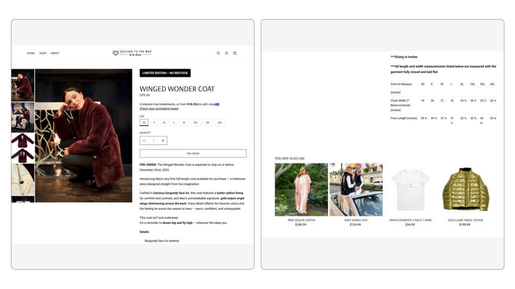
Max Alexander: Winged Wonder Coat
Max Alexander’s limited edition approach creates exclusivity while addressing common fashion concerns.
What works:
“Limited Edition” messaging: Creates urgency and exclusivity
Specific measurements section: Reduces returns by helping customers pick the right size
“You may also like” section: Suggests complementary items to increase AOV
The measurements section deserves special attention. Fashion has high return rates, which are particularly problematic for pre-orders with long lead times. By providing detailed measurements and fit guidance upfront, Max Alexander reduces the likelihood of size-related cancellations and returns.
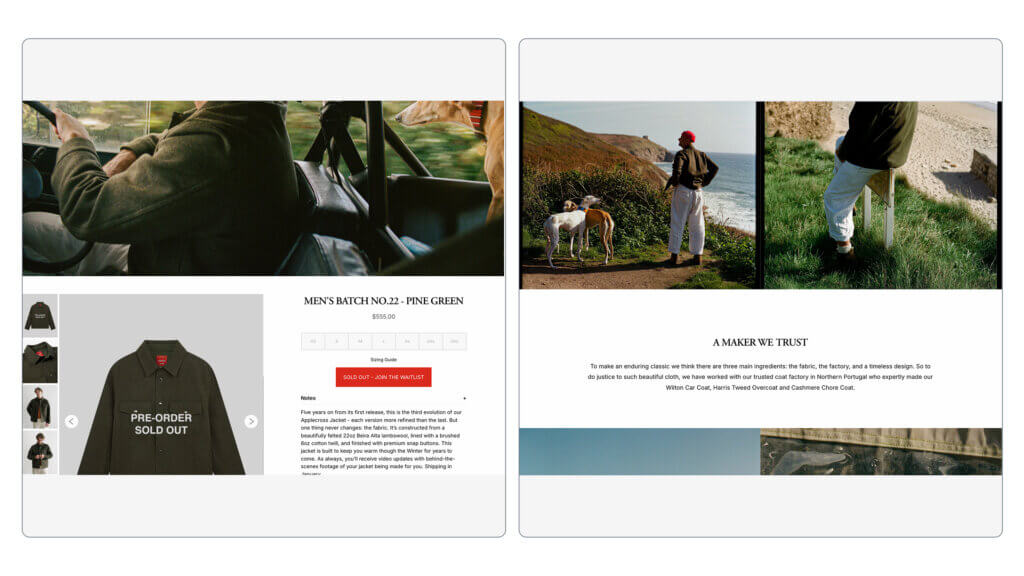
Paynter: ‘Men’s batch no.22’ Woolen Jacket
Paynter’s sold-out pre-order page demonstrates how to handle success while maintaining momentum.
What works:
Sold out pre-orders, swapped for a waitlist: Maintains interest even when inventory is gone
In-context product photos: Lifestyle shots showing the jacket being worn
Storytelling through craft and imagery: Emphasizes the artisanal nature of the product
When pre-orders sell out, many brands miss the opportunity to capture additional demand. Paynter smartly transitions to a waitlist, capturing emails for future batches. The storytelling around craft and materials justifies the price and long lead time while building anticipation for the next batch.
Key Design Elements That Drive Conversions
Now that we’ve seen examples, let’s break down the specific design patterns that make pre-order landing pages convert.
Visual Hierarchy
Your page should guide the eye deliberately. Start with a strong hero image or video at the top, followed by your primary CTA. Use product renders and 3D visualizations to showcase details that photos might miss.
CTA buttons should be oversized for mobile, where most traffic comes from. Use color blocking to create visual separation between sections, making the page scannable. Interactive elements like scroll-triggered animations keep visitors engaged.
Mobile-first design isn’t optional. Over 60% of ecommerce traffic comes from mobile devices. Test your page on actual phones, not just responsive design tools.
Messaging and Copy
Benefits beat features every time. Instead of “Made with carbon fiber,” say “Weighs 30% less than traditional materials.” Address objections proactively throughout your copy.
Make your CTA copy compelling. “Beat the queue” creates urgency better than “Sign up.” “Reserve” removes purchase pressure compared to “Buy now.” Small word changes create big perception differences.
Use onomatopoeia and alliteration to create memorability and movement. “Sip and slurp” feels more dynamic than “drink.” Pop culture references work when they align with your audience and product.
Information Architecture
Structure your content logically, moving from emotional appeal to practical details to social proof. Use accordion FAQs for mobile to keep pages scannable without hiding critical information.
Implement sticky CTAs that remain visible as users scroll. Add same-page anchor links for easy navigation on long pages. Scroll-triggered animations reveal content progressively, maintaining interest.
For video-heavy pages, consider sticky video (picture-in-picture) that follows users as they scroll, keeping your product demonstration visible while they read details.
Social Proof Integration
Place testimonials strategically throughout the page, not just at the bottom. Real-time reservation counters create urgency through social proof: “127 people reserved this product in the last 24 hours.”
Feature press mentions and awards prominently near the top. User-generated content videos work better than produced content because they feel authentic. If you have celebrity endorsements, feature them in the hero section.
For crowdfunding-style campaigns, display the amount funded by backers or invested by venture capital. Large numbers create credibility and reduce risk perception.
Conversion Optimization Elements
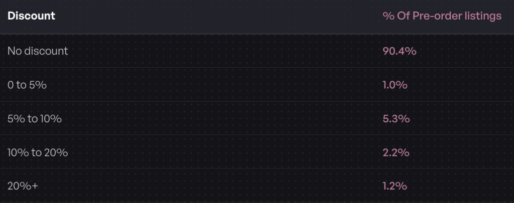
Strategic discounting works when genuine. Early-bird pricing rewards fast action, but our data shows that 91.7% of pre-orders aren’t discounted. You don’t need to cut prices to drive pre-orders if you’re offering real value.
Bundle pricing increases average order value while simplifying decision-making. Free gifts with purchase create perceived value without heavy discounting. Installment payment options make higher-ticket items accessible.
Email capture for updates builds your list while keeping interested customers informed. Countdown timers create urgency when they’re real, not evergreen fake timers.
Best Pre-Order Landing Page Practices by Industry
Different products require different approaches. Here’s how to optimize your pre-order landing page based on your category.
High-Ticket Items ($250+)
Our data shows that 29.3% of pre-order listings are priced over $250. For expensive products, emphasize deposit options. A $50 deposit makes a $500 product feel more accessible.
Provide more detailed product information than you would for lower-priced items. Include extended FAQ sections addressing quality, warranty, and support. High-ticket buyers need more reassurance before committing.
Fast-Turnaround Products (30-day lead time)
When lead times are short, charge-upfront works well. Our data shows 18.4% of pre-orders ship within 30 days. Customers are more comfortable paying upfront when they know they’ll receive the product quickly.
Less risk messaging is needed for short lead times. Focus more on scarcity and urgency instead. Limited quantity messaging works better than “secure your spot 3 months before launch.”
Long-Lead-Time Products (121-150 days)
With 31.6% of pre-orders having 121-150 day lead times, managing expectations becomes crucial. Charge-later significantly reduces friction by not taking money until closer to ship date.
Regular communication plans are essential. Include messaging about progress updates and milestone sharing on your landing page. Show a timeline or roadmap if possible. Address the “what if it gets delayed” concern directly in your FAQ.
Fashion and Seasonal Products
Limited edition messaging creates urgency for fashion items. Make size and variant selection extremely clear, using size charts and fit guides. Our data shows detailed measurements reduce returns significantly.
Return policy prominence matters more in fashion than most categories. Feature your policy clearly and early. Include “You may also like” sections to increase AOV with complementary items.
Common Pre-Order Landing Page Mistakes to Avoid
Even the best pre-order landing page examples show that brands sometimes make critical errors. Here’s what to avoid.
Mistake 1: Unclear Shipping Timeline
“Ships in Q1” creates uncertainty. Be specific: “Ships the week of March 15, 2026” If your timeline changes, update it immediately and communicate clearly with people who’ve already pre-ordered.
Vague timelines increase cancellations and support tickets. Customers can plan around specific dates but get anxious with vague windows.
Mistake 2: Rigid Payment Requirements
Forcing full payment upfront for products shipping 120+ days away creates unnecessary friction. Our data shows 43.8% of merchants choose charge-later methods for good reason: it converts better for long lead times.
Not offering deposit options for high-ticket items limits your audience to people who can afford full payment immediately. Flexibility increases conversions.
Mistake 3: Insufficient Product Information
Generic product descriptions don’t build confidence. Address common questions proactively: dimensions, materials, compatibility, warranty, what’s included. The more expensive or complex your product, the more details you need.
If 35% of potential customers don’t buy due to insufficient information, you’re losing significant revenue. Over-communicate.
Mistake 4: Generic Calls-to-Action
“Buy Now” doesn’t match the pre-order context. “Reserve Your Spot” or “Pre-Order Now” sets accurate expectations. Using “Sign up” instead of more compelling copy like “Beat the queue” reduces urgency.
Consider “Reserve” instead of “Buy Now” to remove purchase pressure. Make deposit amounts clear: “Reserve with $50 deposit” tells customers exactly what happens when they click.
Mistake 5: Ignoring Mobile Experience
With the majority of traffic coming from mobile, a desktop-only optimization strategy fails. Test your entire checkout flow on actual mobile devices. Buttons that work on desktop often feel tiny on phones.
Forms should be minimal on mobile. Reduce fields to essentials. Make CTAs thumb-sized and positioned for easy tapping without zooming or precision targeting.
How to Build the Best Pre-Order Landing Page
You have several options for creating your pre-order landing page, each with tradeoffs.
Option 1: Dedicated Landing Page (Standalone)
Use this approach for major product launches or crowdfunding-style campaigns where you want complete control over the experience.
Tools like Unbounce, Instapage, or Webflow give you design freedom without technical constraints. You can create exactly the page you envision without theme limitations.
For ongoing product releases, restocks, and seasonal launches, native Shopify pre-orders integrate seamlessly with your existing store.
Tools like PreProduct work within your existing Shopify theme, using your product catalog and checkout. This approach maintains brand consistency and requires minimal technical setup.
Pros: Integrated with existing store, no separate checkout, works with your current theme, easier to maintain.
Cons: Design somewhat constrained by theme capabilities, less visual flexibility than standalone pages.
Option 3: Hybrid Approach
Some brands use a landing page for lead capture before pre-orders open, then transition to a product page for actual checkout.
This approach works well for building anticipation. Create buzz with a beautiful landing page, capture emails, then transition to your Shopify store when pre-orders open. This is similar to the Shopify vs Kickstarter decision process for product launches.
Some Shopify apps like PreProduct can also run headless pre-order flows, taking orders outside your main Shopify site while still syncing to your backend.
Setting Up Pre-Orders on Shopify
If you’re using Shopify, setting up pre-orders is straightforward with the right app:
Enable pre-order functionality through PreProduct or similar app
Customize your pre-order button and messaging to match your brand
Set fulfillment holds to prevent premature shipping
Choose your payment method: charge-upfront, charge-later, or deposit
Configure automated customer communications for updates
The key is testing your flow before going live. Place test orders to verify everything works as expected, especially if you’re using deposits or charge-later functionality.
Pre-Order Landing Page Checklist
Use this checklist to ensure you’re not missing critical elements:
[ ] Discount or early-bird pricing (if applicable)
[ ] Bundle offers (if applicable)
[ ] Free gift with purchase (if applicable)
[ ] Mobile-optimized design
[ ] Same-page anchor links for navigation
Frequently Asked Questions
What should a pre-order landing page include?
At minimum, your pre-order landing page should include high-quality product imagery, clear shipping timelines, transparent pricing, a prominent call-to-action, social proof (testimonials or reviews), detailed product specifications, and a FAQ section addressing common concerns like refunds and delays.
What’s the average conversion rate for pre-order landing pages?
Landing page conversion rates vary by industry, but the median across ecommerce is around 7.2%. Top-performing pre-order pages see conversion rates of 11% or higher, particularly when they offer payment flexibility and clear value propositions. Pages optimized through A/B testing see an average 31% lift in conversion rates.
Should I charge upfront or later for pre-orders?
It depends on your lead time and price point. Our data shows 43.8% of pre-order merchants choose charge-later methods. For products shipping within 30 days, charge-upfront works well. For longer lead times (120+ days) or higher prices ($250+), charge-later or deposit options significantly reduce friction and increase conversions.
How long should my pre-order campaign run?
Our data shows that 31.6% of pre-orders have 121-150 day lead times, with 18.4% shipping within 30 days. The length depends on your production timeline and customer patience. For crowdfunding-style launches, 30-60 day campaigns create urgency. For traditional pre-orders, align your timeline with your actual production and shipping schedule.
What’s the best pre-order app for Shopify?
PreProduct offers comprehensive pre-order functionality including charge-upfront, charge-later, and deposit options, fulfillment holds to prevent early shipping, customer portals for order management, and integration with Shopify Flow for automation. The best app depends on your specific needs, but look for flexible payment options, fulfillment controls, and clear customer communication features.
Start Building Your Pre-Order Landing Page
Great pre-order landing pages balance inspiration with information. You don’t need the biggest budget or the flashiest design to convert. You need clarity about your product, flexibility in how customers pay, and trust-building elements that reduce the risk of paying before receiving.
Our analysis of $92.7 million in pre-order revenue shows that merchants who offer payment flexibility see significantly higher conversion rates. The 43.8% of pre-orders using charge-later methods demonstrate that customers value the option to defer payment, especially for longer lead times.
Here’s your action plan: pick 2-3 examples from your industry and identify one specific tactic you can test on your own pre-order page. Maybe it’s adding a deposit option, improving your product photography, or making your CTA more specific. Start with one change, measure the results, then iterate.
Ready to launch your own pre-order campaign? PreProduct makes it easy to set up Shopify pre-orders with flexible payment options, fulfillment holds, and automated customer communications. Check out our setup guide to get started, and start taking pre-orders today to capture demand before your product even ships.
After analyzing $85M+ in pre-order sales, we found that 20.6% of pre-orders ship within 30 days, but 28.1% take 121-150 days. That massive variance in timelines makes inventory management the difference between smooth launches and operational chaos.
Managing pre-order inventory in Shopify isn’t just about enabling “continue selling when out of stock.” It’s about preventing overselling, coordinating fulfillment holds, syncing with ERPs and 3PLs, and making smart decisions about mixed carts. Get it wrong and you’ll face premature shipments, angry customers, and refund requests. Get it right and pre-orders become a powerful tool for validating demand and improving cash flow.
This guide covers the exact Shopify pre-order inventory management workflows used by successful merchants, from setting variant-level stock limits to automating fulfillment holds, backed by data from 1M+ pre-orders.
Pre-order inventory operates differently from standard Shopify inventory management. With regular products, you have stock on hand and Shopify tracks quantities as orders come in. With pre-orders vs backorders, you’re selling products that don’t exist in your warehouse yet.
This creates three key differences:
Negative inventory becomes necessary. When you take pre-orders for products with zero stock, your inventory levels go negative. Not all ERPs or inventory systems support this, which can block pre-orders entirely if not configured correctly.
Payment timing affects inventory reservation. Our data shows that 43.8% of pre-orders use charge-later (vaulted card) payment models. When you charge later, you need to decide: do you reserve inventory when the customer orders, or when you actually charge them? This impacts your demand forecasting and production planning.
Fulfillment holds prevent premature shipping. Standard Shopify orders automatically flow to fulfillment systems. Pre-orders need holds applied so they don’t ship before inventory arrives. Without proper holds, your 3PL might try to dispatch orders the moment they sync to your fulfillment system.
Three Core Inventory Management Challenges
Challenge 1: Preventing overselling when stock limits exist
Not every pre-order campaign can accept unlimited orders. If you have 500 units of a new product inbound, taking 1,000 pre-orders creates a fulfillment nightmare. Variant-level stock limits let you cap pre-orders by SKU, size, or color, automatically hiding buy buttons when limits are reached.
Challenge 2: Keeping pre-orders separate from buy-now inventory
Mixing pre-order and regular inventory in the same tracking system complicates reporting, forecasting, and fulfillment. Our research shows that 62.1% of stores prohibit mixing pre-orders with ready-to-ship items in the same cart. This separation simplifies operations and reduces errors.
Challenge 3: Syncing inventory across Shopify, ERPs, and 3PLs
Pre-orders touch multiple systems. Shopify handles the order, your ERP manages inventory planning, and your 3PL coordinates fulfillment. If these systems don’t properly sync pre-order status (especially the “On Hold” fulfillment state), orders ship too early or get lost in limbo.
Setting Up Inventory Controls for Pre-Orders
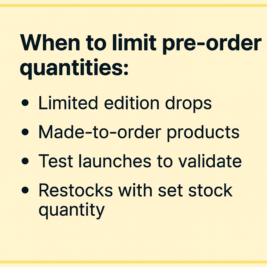
Stock Limits and Quantity Caps
A core component of Shopify pre-order inventory management is setting maximum pre-order quantities to prevent overselling and keep production aligned with demand. Here’s when and how to implement stock limits:
When to limit pre-order quantities:
Limited edition drops with finite incoming stock
Made-to-order products where production scales with orders
Test launches to validate demand before committing to large inventory
Restocks where you know the exact incoming quantity
Variant-level inventory allocation is critical for products with multiple SKUs. A pre-order campaign for a t-shirt might need different limits for small (200 units), medium (500 units), and large (300 units) based on your production run. Product-level limits don’t work here; you need granular control.
Calculating safe pre-order quantities requires accounting for cancellations. Industry data shows an average cancellation rate of 5.4%, so if you can fulfill 1,000 units, consider capping pre-orders at 950 to maintain a buffer.
Pre-order apps like PreProduct can enforce these limits automatically, hiding buy buttons when thresholds are reached and preventing checkout for products at capacity.
Negative Inventory Settings
Shopify’s native inventory system doesn’t automatically support selling when stock is zero. To enable pre-orders, you need to configure negative inventory handling.
Enabling “continue selling when out of stock”
In your Shopify product admin, navigate to the inventory section and check “Continue selling when out of stock.” This tells Shopify to accept orders even when the available quantity is zero or negative.
How pre-order apps handle negative inventory
Quality pre-order apps manage this setting automatically. When you create a pre-order listing, the app toggles the “continue selling” option on. When the pre-order campaign ends, it toggles it back off to prevent accidental overselling.
ERP considerations for negative stock
Not all ERPs support negative inventory by default. Before launching pre-orders, verify your ERP can process orders when on-hand stock is depleted. You’ll typically find this setting in your ERP’s inventory management or product configuration section. Without it enabled, your ERP may reject pre-order syncs from Shopify, creating order processing failures. (We have specific guides on taking pre-orders with specific ERPs here)
Inventory Reservation Strategies
When do you actually reserve inventory for a pre-order: when the customer places the order, or when you collect payment? The answer affects forecasting and working capital.
Reserve at time of sale makes sense for charge-upfront pre-orders. The customer pays immediately, so you reserve inventory immediately. This gives you the most accurate picture of committed stock.
Reserve at fulfillment works better for charge-later models. Since 47.8% of pre-orders are charged within 30 days, you’re essentially forecasting demand but not locking in inventory allocation until payment succeeds. This accounts for payment failures and cancellations but requires more sophisticated inventory planning.
The choice depends on your payment model, cancellation tolerance, and production lead times. Products with long lead times (the most common shipping window is 121-150 days) benefit from earlier reservation to inform manufacturing, while quick-turn restocks can wait until charge time.
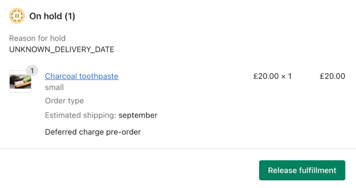
Managing Pre-Order Fulfillment Holds in Shopify
Implementing fulfillment holds prevents pre-orders from shipping before inventory arrives, protecting you from costly fulfillment disasters.
Understanding Shopify’s “On Hold” Status
Shopify’s fulfillment hold feature includes an “On Hold” status that signals an order is valid but shouldn’t be fulfilled yet. This is essential for pre-orders because it prevents premature shipping.
What fulfillment holds do
When an order has “On Hold” status, it appears in your Shopify orders admin but doesn’t flow to automatic fulfillment systems. This buys you time to wait for inventory to arrive before releasing orders for shipping.
How pre-order apps automatically apply holds
Pre-order apps should place fulfillment holds automatically when orders contain pre-order items. For Shopify stores, this means setting the fulfillment status to “On Hold.” For mixed carts with both pre-order and buy-now items, sophisticated apps apply holds only to the pre-order line items while letting regular items fulfill normally.
Releasing holds when inventory arrives
When your pre-order inventory hits the warehouse, you need to release fulfillment holds. This can be done manually per order, in bulk for an entire pre-order listing, or automatically through inventory-aware triggers. The key is having clear workflows via your pre-order app and documentation on who releases holds and when, to avoid bottlenecks.
ERP and 3PL Compatibility
Not all fulfillment systems natively recognize Shopify’s “On Hold” status, which creates integration challenges for managing pre-orders with your ERP or 3PL.
Systems with native “On Hold” recognition
The following 3PLs and fulfillment platforms natively sync and respect Shopify’s “On Hold” status:
ShipBob
RyderShip
Shopify Fulfillment Network (SFN)
ShipStation (with proper configuration)
Flexport
If you use one of these, pre-order holds will automatically prevent fulfillment until you release them.
Mapping holds to custom internal statuses
ERPs and 3PLs without native support require workarounds. Common approaches include:
Mapping “On Hold” to a custom status in your system
Using Shopify tags (like “pre-order” or “hold-fulfillment”) to trigger routing rules
Leveraging line-item properties to mark pre-order items
Creating separate fulfillment locations for pre-orders, either virtual or real
The critical requirement is testing end-to-end before launch. Create a test pre-order, place it, and verify it doesn’t ship from your 3PL until you explicitly release it.
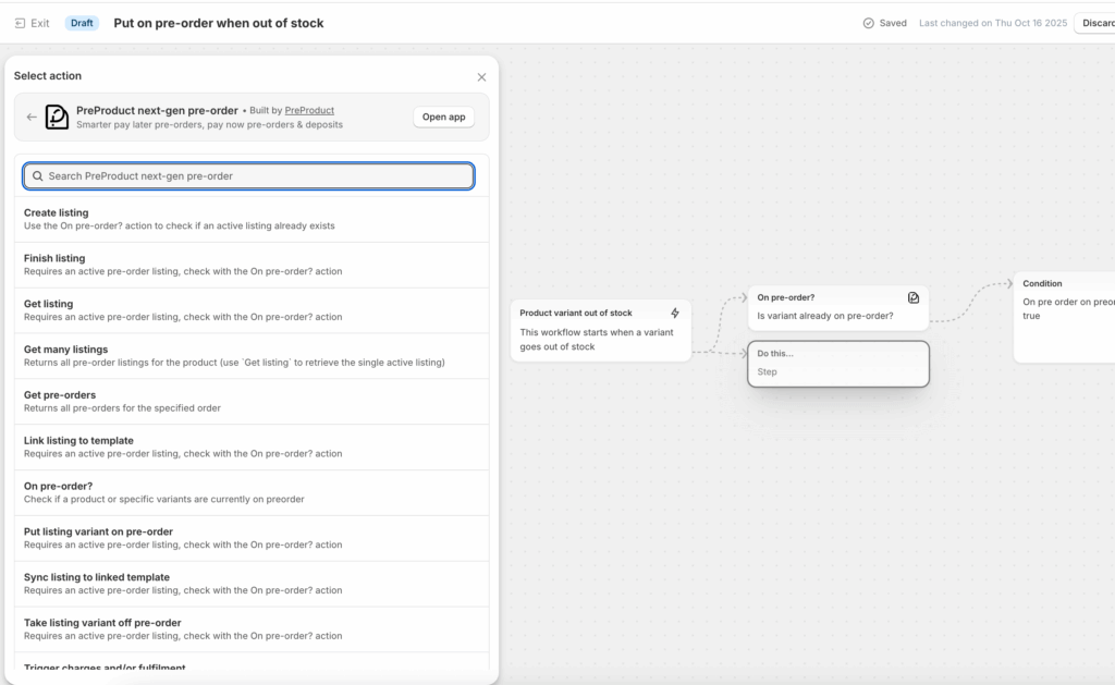
Automation with Shopify Flow
Shopify Flow enables sophisticated automation for pre-order fulfillment holds, especially useful for stores managing multiple pre-order campaigns simultaneously.
Triggering fulfillment holds based on product tags
Create a Flow workflow that monitors orders and applies “On Hold” status when line items have specific tags (like “pre-order” or the product collection). This ensures even if your pre-order app misses an edge case, holds still apply.
Auto-releasing holds when stock quantity changes
Set up a Flow that monitors product inventory levels. When a product’s available quantity increases (indicating stock arrival), automatically release fulfillment holds for orders containing that product. This eliminates manual release work for large pre-order campaigns.
PreProduct’s Shopify Flow integration
PreProduct offers 15 custom Shopify Flow actions and 16 triggers specifically for pre-orders, giving you granular control over hold application, charge timing, and release workflows. This is particularly valuable for stores wanting to integrate pre-order inventory management with broader operational automation.
Handling Mixed Carts and Partial Fulfillment
Three Approaches to Mixed Buy-Now + Pre-Order Carts
When customers want to purchase both in-stock and pre-order items together, you have three strategic options. Each has different implications for inventory management and operations.
Option 1: Prohibit mixing (62.1% of stores choose this)
Force customers to check out separately for pre-order and buy-now items. This is the cleanest approach operationally because it keeps pre-order and regular inventory completely separate in your fulfillment system. At PreProduct, this is enforced via redirecting customers to a checkout page or pre-order only cart. Another common approach is showing a message to customers that they need to check out separately for pre-order and buy-now items and just blocking the checkout until they comply.
Benefits: Simple inventory tracking, no partial fulfillment complexity, clear customer expectations. Drawbacks: Lower average order value, potential friction in checkout experience.
Option 2: Multiple shipments
Allow mixed carts but fulfill items separately. In-stock products ship immediately while pre-order items ship when available.
Benefits: Better customer experience, higher average order value, no delays for in-stock items. Drawbacks: Higher shipping costs (you pay twice), more complex 3PL coordination, requires partial fulfillment support.
Option 3: Hold all items
Accept mixed carts but hold the entire order until pre-order items are ready, then ship everything together.
Benefits: Single shipping cost, simpler logistics than option 2. Drawbacks: Delays in-stock items unnecessarily, potentially frustrating customers, higher cancellation risk.
Inventory Implications of Each Strategy
How mixed carts complicate inventory tracking
When you mix pre-order and in-stock items, your inventory system needs to track:
Which line items are pre-order vs. buy-now
When each type of item will be available
Whether partial fulfillment is allowed
How to allocate inventory when items transition from pre-order to in-stock
This requires more sophisticated inventory management than single-type orders.
Split fulfillment requirements for 3PLs
Most modern 3PLs support partial fulfillment (ShipStation, Shippo, ShipBob, Flexport, ShipMonk, and others). However, you need to verify your specific 3PL can:
Recognize which line items are held vs. ready to ship
Create separate shipments from a single order
Sync tracking information back to Shopify for each shipment
Handle inventory allocation correctly for split orders
In 2024, Shopify released a split shipping feature that can be used to enforce charging seperate shipments for line items with different ship dates.
Impact on average order value vs. operational complexity
Allowing mixed carts typically increases AOV as customers add impulse purchases to pre-order checkouts. However, this comes with operational overhead. Calculate whether the revenue gain justifies the complexity for your specific operation.
Setting Up Your Policy
Configuration in pre-order apps
Quality pre-order apps let you choose your mixed cart policy:
Redirect to checkout with pre-order items only (prohibit mixing)
Allow mixing with automatic partial fulfillment tagging
Allow mixing with full-order hold until pre-orders are ready
Configure this based on your 3PL’s capabilities and operational capacity.
Customer communication requirements
Whichever policy you choose, communicate it clearly before checkout. Display messages like:
“Pre-order items will ship separately from in-stock items”
“Your entire order will ship together when pre-order items are available in [estimated date]”
“Pre-order and in-stock items must be purchased separately”
Clear expectations reduce support tickets and cancellations.
Integrating Pre-Orders with ERPs and Inventory Systems
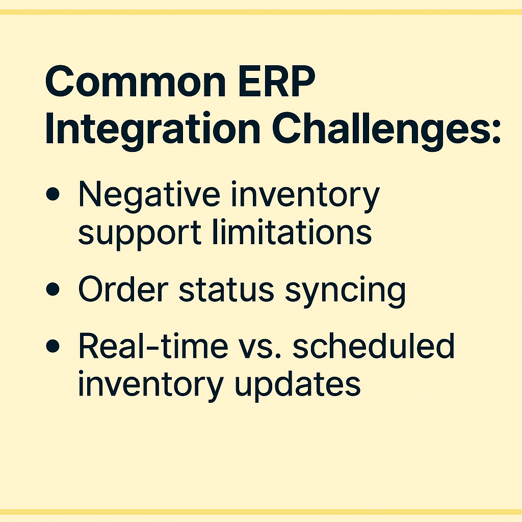
Common ERP Integration Challenges
ERPs handle enterprise inventory planning, but many weren’t designed with pre-orders in mind. Here are the most common friction points:
Negative inventory support limitations
As mentioned earlier, not all ERPs process orders when inventory is negative or zero. During high-demand pre-order launches, sync delays between Shopify and your ERP can cause overselling if the ERP rejects orders based on stock levels.
Order status syncing (“On Hold” recognition)
Shopify’s “On Hold” fulfillment status may not map directly to your ERP’s internal status system. Without proper mapping, pre-orders might appear as regular unfulfilled orders in your ERP, triggering incorrect fulfillment workflows.
Real-time vs. scheduled inventory updates
Some ERP-Shopify connectors sync in real-time while others run on schedules (every 15 minutes, hourly, etc.). Scheduled syncing creates windows where customers can order based on outdated inventory data, leading to overselling during flash pre-order campaigns.
Best Practices for ERP Integration
Verify negative inventory settings before launch
Log into your ERP’s inventory management section and confirm negative inventory is enabled for products you plan to offer as pre-orders. Test by manually creating an order when stock is zero and verify it processes successfully.
Map Shopify statuses to internal ERP workflows
Work with your integration partner or developer to explicitly map:
Document these mappings for your team and review them quarterly as systems evolve.
Test pre-order flow end-to-end before going live
Create a test pre-order product, place orders through checkout, and track them through every system:
Does the order appear correctly in Shopify?
Does it sync to your ERP with proper status?
Does your ERP recognize it shouldn’t fulfill yet?
Can you trigger fulfillment release from both Shopify and your ERP?
Does inventory reservation work correctly?
Only launch publicly after confirming the full flow works.
Use line-item properties for advanced routing
For complex workflows, leverage Shopify’s line-item properties to pass pre-order metadata to your ERP:
Estimated ship date
Pre-order campaign ID
Payment status (charged upfront vs. charge-later)
Stock source (made-to-order vs. incoming restock)
This additional context helps ERPs route orders correctly without relying solely on fulfillment status.
Popular ERPs and Pre-Order Compatibility
NetSuite: Supports negative inventory and custom order statuses. Requires configuration and typically custom integration work for full pre-order support.
Brightpearl: Native negative inventory support, good webhook capabilities for pre-order status syncing.
Cin7: Handles negative inventory well, offers Shopify integration, may require custom field mapping for fulfillment holds.
QuickBooks Commerce: Basic pre-order support through inventory adjustments and order tags.
Most 3PLs don’t have dedicated pre-order modules. Instead, they rely on signals from Shopify to identify which orders to hold and which to ship.
Reliance on Shopify signals
3PLs typically use:
Fulfillment status (“On Hold” vs. “Unfulfilled”)
Financial status (is it marked as ‘paid’ in Shopify)
Order tags (like “pre-order” or “hold-fulfillment”)
Custom fields or line-item properties
Fulfillment location assignments
Your pre-order app must properly set these signals, and your 3PL must be configured to respect them.
Preventing automatic fulfillment of pre-orders
By default, some 3PLs automatically fulfill orders as soon as they sync from Shopify. Without proper holds in place, this means pre-orders ship before inventory arrives. Testing the hold workflow with your 3PL before launch is non-negotiable.
3PLs with Native Pre-Order Support
These fulfillment providers either natively recognize Shopify’s “On Hold” status or offer built-in pre-order workflows:
ShipBob: Full “On Hold” status support, real-time bidirectional inventory syncing, partial fulfillment capabilities.
ShipStation: Configurable automation rules can hold orders based on tags or status, supports partial fulfillment.
Flexport: Recognizes hold status, offers sophisticated inventory management for complex pre-order scenarios.
ShipMonk: Custom status mapping available, supports split shipments for mixed carts.
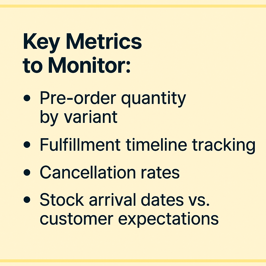
Track orders at the SKU level, not just product level. A product with five sizes needs five separate quantity trackers to inform production accurately. This granular visibility prevents the scenario where you have 1,000 total pre-orders but didn’t track that 600 are size medium and you only planned for 200.
Fulfillment timeline tracking
Monitor how long pre-orders sit in your system before fulfillment. Since pre-orders can ship within 30 days but often take much longer, understanding your timeline distribution helps set customer expectations and plan working capital.
Cancellation rates
The industry average cancellation rate is 5.4%. Track yours by campaign, product type, and shipping timeline. Longer timelines generally correlate with higher cancellations, so factor this into inventory planning.
Stock arrival dates vs. customer expectations
Track the gap between promised ship dates and actual fulfillment. Delays erode trust and increase cancellation and refund requests. If you consistently miss dates, adjust your estimated timelines to be more conservative.
Using Pre-Order Data for Demand Forecasting
SKU-level demand signals
Pre-orders provide early demand data before production commitments. If a new product gets 500 pre-orders in week one, you can confidently scale production knowing demand exists. This is far more reliable than forecasting based on similar products or market research.
Production run planning
Use pre-order quantities to right-size manufacturing. If you’re deciding between a 1,000-unit or 2,500-unit production run, 750 pre-orders in hand makes the decision data-driven rather than a guess.
Percentage of stock limit reached (if limits are set)
Payment collection status (charged vs. pending charge)
Estimated fulfillment dates and current status
Stock level alerts
Set notifications for:
When pre-order limits reach 80% capacity (time to decide if you’ll expand)
When expected stock arrival dates approach (prepare for fulfillment release)
When cancellation rates exceed normal thresholds (investigate cause)
Variant performance tracking
Identify which variants are in highest demand. This informs future production mixes and helps you avoid the common mistake of producing equal quantities of all sizes when demand is heavily skewed.
Preventing Common Pre-Order Inventory Mistakes
Mistake #1: Not Setting Stock Limits
Risk of overselling when incoming inventory is finite
If you have 500 units arriving but take 1,000 pre-orders, you face a crisis. You must either disappoint 500 customers with cancellations and refunds, expedite additional production at high cost, or face delivery delays that damage your brand.
Build in this buffer to account for cancellations without overselling your actual stock.
Mistake #2: Poor ERP/3PL Communication
Orders shipping prematurely
The most common pre-order disaster is orders fulfilling before inventory arrives. This happens when:
Fulfillment holds aren’t properly applied
ERP/3PL doesn’t recognize hold status
Manual release happens accidentally
Integration failures cause orders to sync without hold flags
Inventory sync failures
Real-time vs. scheduled syncing matters during high-volume launches. A 15-minute sync delay can result in hundreds of over-sold units when a popular pre-order goes live.
Testing requirements before launch
If you use a third-party 3PL and/or ERP, never launch a pre-order campaign without running complete tests through your fulfillment stack. The cost of testing is minutes; the cost of a failed launch is thousands in refunds, rush shipping, and brand damage.
Mistake #3: Unclear Customer Communication
Setting accurate estimated ship dates
Optimistic ship dates feel good in the moment but create problems when missed. Use data from past campaigns: if your average timeline is 90 days, quote 90-120 days rather than 60 days and hope.
Updating customers when timelines change
Production delays happen. The worst response is silence. Send proactive updates:
When delays are likely (before promises are missed)
With specific new timelines (not vague “coming soon”)
Offering options (wait or cancel) for long delays
Remember that 28.1% of pre-orders have 121-150 day shipping windows. Customers accept long timelines if communicated clearly upfront.
Choosing the Right Pre-Order App for Inventory Management
Key Features to Look For
When evaluating pre-order apps for Shopify, prioritize these inventory management capabilities:
Variant-level stock limits: Not all apps support capping pre-orders by individual SKU or variant. This is critical for products with multiple sizes, colors, or configurations.
Automated fulfillment holds: The app should automatically apply “On Hold” status to pre-order items without manual intervention.
ERP/3PL integration capabilities: Look for apps that can set Shopify tags and line item properties (for custom flow setting), API access, or native integrations with your specific fulfillment stack.
Flexible payment options: Charge-upfront, charge-later, and deposit options affect inventory reservation timing. Choose an app that supports your preferred payment model.
Real-time inventory syncing: Especially important for high-volume launches where seconds matter.
PreProduct’s Inventory Management Features
PreProduct is a Shopify pre-order app built specifically to handle the inventory management challenges covered in this guide:
Automatic fulfillment holds with “On Hold” status: Pre-orders automatically receive Shopify’s “On Hold” fulfillment status, preventing premature shipping to 3PLs that recognize this signal.
Variant-specific pre-order limits: Set maximum quantities per variant, automatically hiding buy buttons when limits are reached to prevent overselling.
Integration with Shopify Flow: 15 custom Flow actions and 16 triggers enable sophisticated automation for inventory-aware charging, fulfillment release, and status updates.
Separate admin for pre-order tracking: Monitor all pre-orders in a dedicated dashboard separate from your regular Shopify orders, simplifying inventory allocation and reporting.
Flexible payment models: Support for charge-upfront, charge-later (vaulted card), deposits, and multi-step payment plans. Each model affects inventory reservation differently, and PreProduct handles all of them.
The app is designed to address the technical workflows and operational challenges discussed throughout this article, backed by insights from processing $100M+ in pre-order sales.
Conclusion
Effective Shopify pre-order inventory management comes down to five core principles:
Set variant-level stock limits to prevent overselling when incoming inventory is finite. Use the formula: incoming inventory × (1 – cancellation rate) to calculate safe maximums.
Implement fulfillment holds to prevent premature shipping. Verify your ERP and 3PL recognize and respect “On Hold” status before launching.
Test integrations thoroughly before going live. Run pre-orders through your entire fulfillment stack, confirming holds work and inventory syncs correctly.
Choose a mixed cart policy based on operational capacity. 62.1% of stores prohibit mixing for good reason; only allow mixed carts if you can handle the complexity.
Track metrics to improve forecasting. Monitor pre-order quantities by variant, cancellation rates, and fulfillment timelines to refine future campaigns.
Pre-orders offer powerful benefits for validating demand, improving cash flow, and capturing revenue before inventory arrives. But these benefits only materialize with proper inventory management. By implementing the workflows in this guide, you’ll avoid the common mistakes that turn promising pre-order campaigns into operational nightmares.
Ready to manage pre-orders with confidence? Start taking pre-orders on Shopify with tools built for proper inventory management, fulfillment holds, and system integration.
Managing cash flow while keeping customers happy can feel like walking a tightrope. Shopify partial payments let you collect a portion of the sale upfront and charge the remaining balance later, creating flexibility for both you and your customers. Whether you’re launching a new product line, managing pre-orders, or selling higher-ticket items, understanding how to implement partial payment strategies can transform how you capture revenue. If you’re new to pre-orders, start with our complete guide to pre-orders on Shopify before diving into payment models.
From processing over $85 million+ in pre-order sales, we’ve learned what actually works. This guide breaks down everything you need to know about Shopify deposits, charge-later options, and installment plans so you can choose the right approach for your store.
What Are Shopify Partial Payments?
The Core Concept
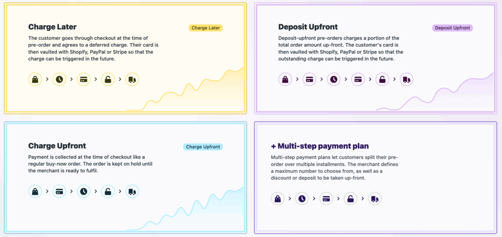
Shopify partial payments enable merchants to charge a portion of the sale upfront while deferring the remaining balance until later. Instead of collecting the full amount at checkout, you might take 30% now and charge the rest when the product ships. This approach relies on vaulted card technology, where payment details are securely stored with your payment provider, allowing you to trigger charges at a later date without restrictive authorization windows.
The flexibility extends beyond simple deposits. Merchants can structure payments in three main ways: deposit upfront with a later charge, full charge-later with zero upfront cost, or multi-step installment plans that spread payments across several transactions.
Three Main Approaches to Partial Payments
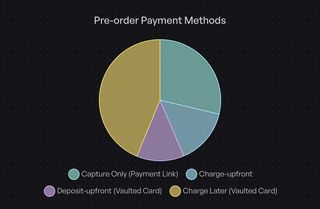
Based on data from over one million pre-orders, here’s how merchants actually structure their payments:
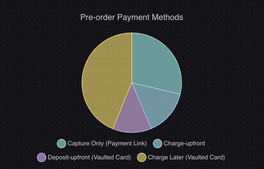
Charge-later accounts for 43.8% of all pre-order listings (75,781 listings). Customers complete checkout without paying anything upfront, and merchants trigger the charge when ready to ship. This approach maximizes conversion by removing initial friction while still securing the order.
Deposit upfront represents 12.6% of listings. Merchants collect a partial payment during checkout, typically 20-50% of the product value, then charge the balance when the item is ready. This balances customer commitment with flexibility.
Charge upfront makes up 14.9% of listings. The full amount is collected immediately at checkout, providing instant cash flow but requiring customers to pay before receiving the product.
The remaining 28.7% use capture-only approaches, where payment is taken through payment links rather than vaulted cards.
Why Partial Payments Matter in 2026
The shift toward flexible payment models reflects changing customer expectations. Buyers increasingly expect options beyond “pay now or don’t buy.” For merchants, partial payments solve a critical challenge: how do you capture revenue before inventory arrives without alienating customers who want to minimize upfront commitment?
Traditional Shopify payment authorizations expire after 7 or 30 days depending on your payment provider and Shopify plan. Partial payment solutions using vaulted cards bypass these limitations, giving you control over when charges occur regardless of lead times.
How Shopify Partial Payments Work
Technical Requirements
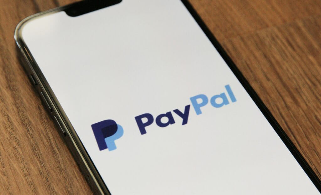
Three payment providers currently support the vaulted card technology required for deferred charges: Shopify Payments, PayPal, and Authorize.net (although we’ve heard reports of Cybersource recently being supported). Any credit card that passes standard checkout validation works for partial payments; no special card types are required.
The system captures and securely stores card details at initial checkout. When you’re ready to charge, you trigger the payment through your pre-order app or payment platform. The customer doesn’t need to re-enter payment information or take any action.
The Customer Experience
From a customer perspective, partial payments create a streamlined experience. They complete checkout once, entering payment details as they normally would. For deposit-based approaches, they see the deposit amount charged immediately. For charge-later options, no charge appears until you trigger it.
Customers can monitor their deferred payment status through customer portals that show expected shipping dates, outstanding balances, and payment schedules. This transparency reduces support inquiries and maintains trust during longer lead times.
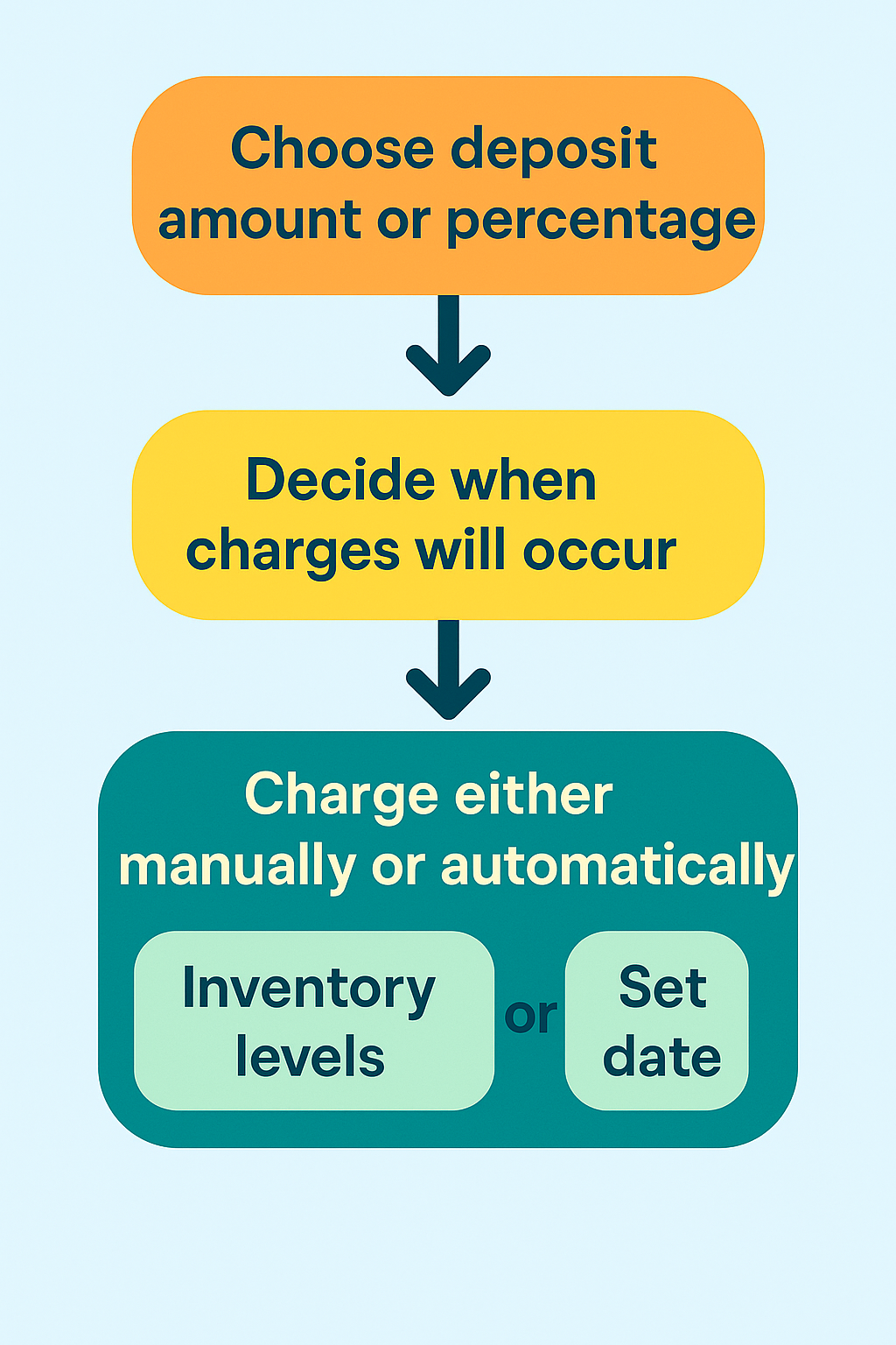
The Merchant Workflow
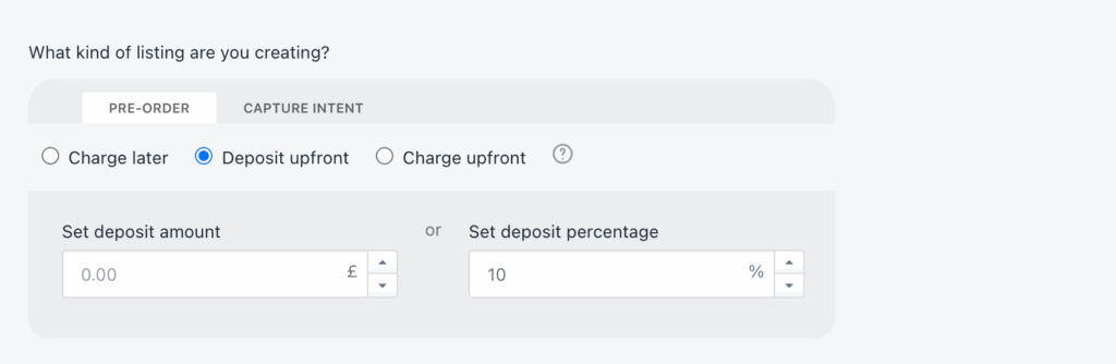
Setting up partial payments requires choosing your deposit amount or percentage, configuring when charges will occur, and customizing customer communications. You can set charges to trigger manually when you’re ready to ship, automatically based on inventory levels, or on specific dates.
For deposit approaches, you specify whether to charge a fixed amount or a percentage of the product price. The system calculates and displays the deposit at checkout, shows the remaining balance, and handles the math automatically.
When triggering remaining charges, you can process them at the listing level (charging all customers for a specific product) or at the customer level (charging individual orders as they’re ready). Failed charges generate automated recovery emails, giving customers the opportunity to update payment methods before orders are cancelled.
Benefits of Partial Payments for Pre-orders
For Merchants: Extended Sales Windows
Traditional payment authorizations create artificial constraints. With Shopify Payments, authorizations typically expire after 7 days, though this can extend to 30 days in some cases. If your product lead time exceeds these windows, you face a choice: charge upfront and risk higher refund requests, or wait until inventory arrives and lose revenue velocity.
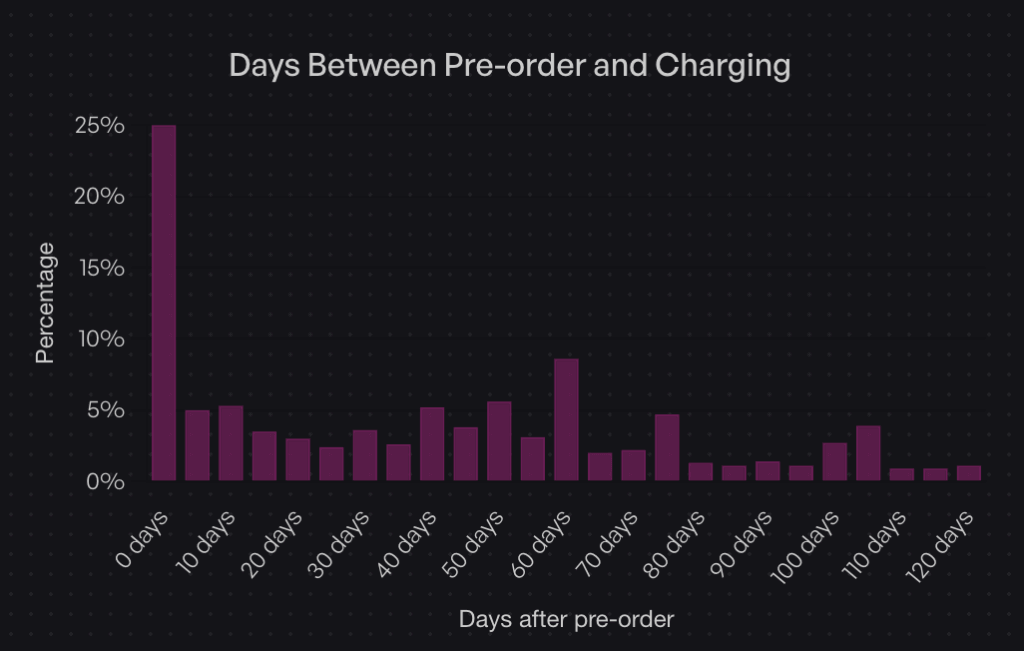
Partial payments eliminate this constraint. Data shows that while 25% of merchants charge immediately (Day 0), 47.8% charge within the first 30 days of the order. The flexibility to control charge timing means you can align revenue capture with your specific supply chain reality, not arbitrary authorization periods.
For Merchants: Reduced Refund Administration
Charge-upfront pre-orders create customer frustration when delays occur. Customers who’ve already paid feel entitled to immediate resolution, generating support tickets and refund requests. Charge-later and deposit models reduce this friction. Customers who haven’t fully paid yet tend to be more patient with timeline adjustments, as they haven’t fully committed their funds.
This isn’t just theory. Merchants using charge-later approaches report fewer cancellations and support inquiries compared to charge-upfront campaigns, particularly for products with variable lead times.
For Customers: Lower Initial Commitment
The psychological barrier of a $300 product is very different from a $75 deposit. Partial payments let customers secure items they want without the immediate financial impact of the full purchase. This is particularly powerful for higher-ticket items where the decision to buy might be delayed by cash flow concerns.
Customers who make partial payments also demonstrate stronger purchase commitment. Having “skin in the game” through a deposit makes them more likely to complete the purchase compared to waitlists or notification systems with zero commitment.
Real-World Impact: The Holochain Foundation Example
When Holochain Foundation launched their Web3 platform hardware, they faced a classic challenge: significant production costs with uncertain demand. They used deposit-based pre-orders to validate interest and secure upfront capital for manufacturing.
By collecting deposits, they confirmed real demand beyond survey responses or email signups. The deposits provided working capital to initiate production runs. And critically, they maintained full control over when to charge the remaining balance, coordinating charges with actual shipping timelines rather than racing against authorization expirations.
When to Use Deposits vs Charge-Later vs Installments
Strategic Decision Framework
The right payment approach depends on three factors: product price point, lead time length, and your cash flow needs. Here’s how to think through the decision.
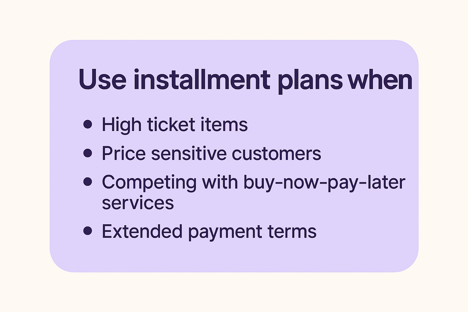
Use Deposit Upfront When:
High-ticket items ($500+) benefit from deposits. The partial payment demonstrates commitment without requiring customers to part with the full amount months before delivery. We believe optimal deposit amounts range from 10-50% of the product value.
Long lead times (three months or longer) work better with deposits than charge-later. Asking customers to wait 90+ days with zero payment creates uncertainty. A deposit confirms their commitment and provides you with working capital during the production window.
Custom or made-to-order products justify deposits because you’re investing resources specifically for that customer. The deposit offsets your production costs and reduces the risk of cancellations after you’ve already started work.
When you need early production capital, deposits inject cash flow before the product is ready to ship. This is particularly valuable for crowdfunded-style launches or when production minimums require upfront investment.
Merchants who use deposit approaches represent 12.6% of listings in our dataset. While less common than charge-later, deposits serve a specific purpose for higher-value, longer-timeline products.
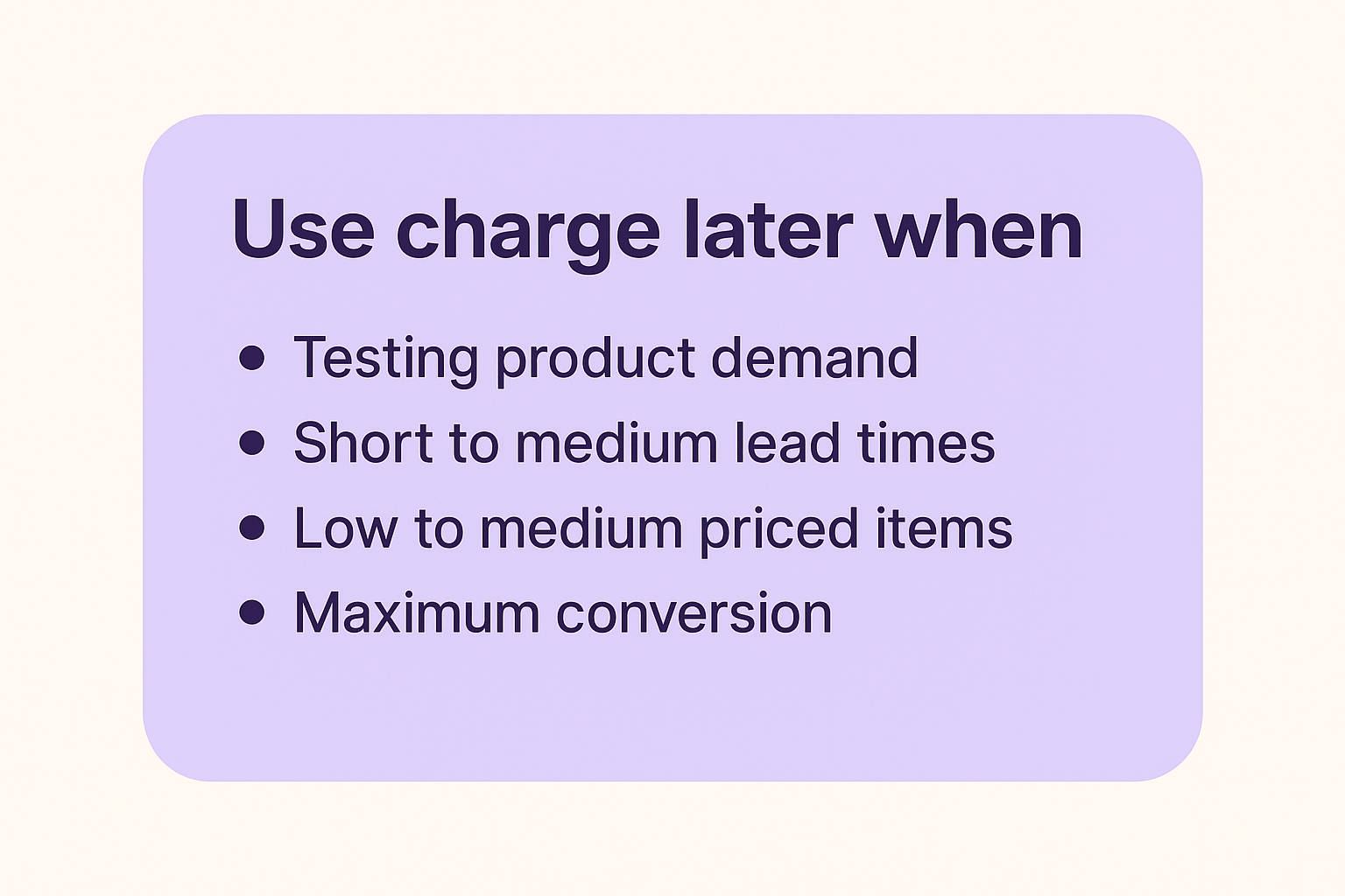
Use Charge-Later When:
Testing product demand works better with charge-later. The zero upfront cost maximizes conversion, giving you the truest read on interest. You can validate demand without customers needing to part with money immediately.
Short to medium lead times (one to two months) pair well with charge-later. Customers don’t perceive significant risk in the timeline, and you maintain flexibility on charge timing.
Low-medium priced items ($50-$300) see strong performance with charge-later. The payment amount isn’t large enough to justify deposits, and the reduced friction at checkout improves conversion rates.
When you want maximum conversion, charge-later removes all payment friction. Customers complete checkout knowing they won’t be charged until the product ships, eliminating the primary objection to pre-ordering.
The data supports this approach: 43.8% of pre-order listings use charge-later models, making it the most popular payment timing choice. The appeal is clear: secure orders now, charge when convenient, avoid authorization periods entirely.
Use Installment Plans When:
High-ticket items ($1,000+) benefit from spreading payments across multiple installments. This makes expensive products accessible to customers who want to spread the cost over time, similar to how Affirm or Klarna work.
Price sensitive customers who prefer to spread the cost over time. Offering installment plans allows you to offer a lower price point to customers who prefer to pay over time. Think of this like BNPL (buy-now-pay-later) but the customer receives the product later instead of upfront.
Competing with buy-now-pay-later services becomes easier when you offer your own installment options. Rather than paying fees to third-party services, you can structure multi-step payment plans that charge customers directly.
Extended payment terms (60-90+ days or longer) work well for premium product positioning. Luxury items or high-end equipment can be structured with monthly payments that align with when customers actually receive and use the product.
Multi-step payment plans work by splitting pre-orders into multiple automatic charges on a defined schedule. Customers select their preferred number of installments at checkout, and the system automatically processes charges based on your configured frequency (daily, weekly, or monthly).
Available for Shopify Plus stores and non-Shopify platforms, these plans integrate with charge-later or deposit-upfront pre-order models. You can configure maximum installment limits, offer discounts for choosing payment plans, and customize the customer-facing interface to match your brand. Customers access a portal showing their payment history, outstanding balance, and upcoming charge dates.
Optimal Deposit Percentages by Scenario
For physical goods in the $200-$500 range: 25-35% deposits work well. This is enough to confirm commitment without creating significant friction.
For higher-ticket items ($500-$1,500): 20-30% deposits provide meaningful capital while keeping the initial amount manageable. A $300 deposit on a $1,200 product feels more acceptable than a $600 deposit.
For custom or made-to-order products: 40-50% deposits are appropriate. Your costs are higher, customization requires more resources, and the commitment level should reflect the work involved.
For products with very long lead times (6+ months): 30-40% deposits strike a balance. Too small and it doesn’t feel meaningful; too large and customers balk at paying so much so far in advance.
The key is putting it in the context of your business and customer-base. Your hard fought intuition is a great starting point, as what works for one product or audience may not work for another.
How to Set Up Shopify Partial Payments
Option 1: Manual Setup (Not Recommended)
Some merchants attempt to create partial payment flows manually through Shopify’s native features. This involves creating separate deposit products, generating unique discount codes for the remaining balance, and manually coordinating payment collection with customers.
Why this approach fails: The customer experience is poor. They purchase a “deposit” product, then receive an email later with a discount code and instructions to buy the actual product. It’s confusing and unprofessional.
The manual coordination is time-consuming. You’re manually tracking which customers paid deposits, generating individual discount codes, and sending follow-up emails. For anything beyond a handful of orders, this becomes unmanageable.
You lose analytics and segmentation. These orders don’t flow through normal Shopify reporting as pre-orders; they look like separate product purchases. You can’t easily segment customers who have deposits pending or identify which partial payment campaigns perform best.
The approach is error-prone. Forgotten discount codes, incorrect discount amounts, customers who lose emails, all these issues create support tickets and frustration.
(FYI: Early on in PreProduct, before Shopify supported vaulted card payments; we actually offered a version of this ‘deposit product’ approach. It was pretty painful and we discontinued it as soon as the vaulted card functionality was released.)
First, choose your payment timing approach. Decide whether you’re collecting full payment upfront, charging later, or taking a deposit. This decision drives the rest of your configuration.
Second, set your deposit amount or percentage if applicable. You can specify either a fixed dollar amount or a percentage of the product price. The app automatically calculates and displays this at checkout.
Third, configure automatic charge triggers or plan for manual triggering. Some merchants prefer to trigger charges manually when they’re ready to ship. Others want automation based on inventory levels, where charges occur automatically when stock is added to Shopify.
Fourth, customize your customer portal and communications. Set up the messaging customers see on product pages, in cart, and at checkout. Configure email sequences for order confirmations, upcoming charges, and payment reminders.
Fifth, set up failed charge notifications and recovery workflows. If a customer’s card declines when you trigger the remaining charge, automated emails give them an opportunity to update their payment method before you cancel the order.
Sixth, test the complete flow. Place a test order through the entire checkout process, confirm the deposit or charge-later behavior works correctly, and verify that triggering the remaining charge functions as expected.
Configuration Best Practices
Communicate lead times clearly on product pages. Use specific dates when possible (“Ships in February 2026”) or windows when dates are uncertain (“Ships 8-12 weeks after order”). Vague language like “coming soon” creates customer anxiety.
Set realistic charge dates based on your actual supply chain. Building in buffer time is smart, but don’t pad timelines excessively. Customers appreciate accuracy more than conservatively long estimates.
Craft deposit policy language that explains what customers are paying now, what they’ll be charged later, and when that charge will occur. This belongs in multiple places: product page, cart, and checkout.
Design email sequences for payment reminders that notify customers a few days before their remaining balance will be charged. This reduces surprise and gives them time to ensure sufficient funds are available.
Managing Partial Payment Orders
Order Tracking and Segmentation
Once partial payment orders start flowing in, you need visibility into payment status across your customer base. Shopify deposits apps like PreProduct provide dashboards that show which orders have deposits paid, which customers are on charge-later status, and which charges have been triggered but not yet collected.
Segmentation becomes critical for larger campaigns. You might need to charge customers in batches as inventory arrives in waves, or handle exceptions for customers requesting earlier or later charges. Good pre-order tools let you filter by payment status, creation date, product, and other attributes.
Triggering Remaining Charges
Manual charge initiation gives you complete control. You review orders ready to ship, select the customers to charge, and trigger the charges. This works well for smaller volumes or when you need to carefully coordinate charges with actual inventory availability.
Automated triggers based on dates work for predictable timelines. If you know products will ship on March 15th, you can configure charges to trigger automatically on March 10th, giving time for payment processing before you need to create shipping labels.
Stock-based triggers charge customers automatically when you add inventory to Shopify. You receive a shipment, update your stock levels, and the app detects the change and initiates charges. This aligns charges with actual product availability rather than estimated dates.
Batch processing lets you charge large groups simultaneously. If you have 500 orders and inventory for all of them arrives, you can process all charges in one action rather than triggering them individually.
Failed Charge Management
Not every charge attempt succeeds. Cards expire, customers change banks, or funds aren’t available. When charges fail, you need a recovery process.
Common failure reasons include expired cards (especially problematic for long lead times), insufficient funds, or cards that were cancelled and replaced. Some failures are soft declines that will succeed if retried; others are permanent until the customer updates their payment method.
Automated recovery emails immediately notify customers when charges fail. These emails explain what happened, provide a link to update payment information, and set a deadline before the order is cancelled. Clear, non-accusatory language is important; frame it as “we need your help to complete your order” rather than “your payment failed.”
Grace periods and retry logic give customers time to fix issues. A common approach: retry the charge once after 24 hours, send another notification if it fails again, and give customers 3-5 days total before cancelling the order. The timeline should balance giving customers adequate time with your need to manage inventory.
When to cancel vs hold orders depends on your inventory situation. If you have excess inventory, you can be generous with grace periods. If inventory is tight and you have a waitlist, shorter grace periods let you reallocate products to customers whose payments will succeed.
Refund Scenarios
Partial payments complicate refunds compared to standard orders. If you’ve collected a deposit and need to refund, do you refund just the deposit? What if you’ve already charged the remaining balance?
Partial vs full refunds depend on when the refund request comes in and why. If a customer wants to cancel before you’ve triggered the remaining charge, you refund the deposit. If they want to cancel after being fully charged but before shipping, you refund everything. If the product has shipped and they’re returning it, your normal return policy applies.
Split payment complications arise when deposits and final charges occur far apart. Your accounting needs to handle a deposit collected in January and a refund processed in March that pulls from a different financial period.
Customer communication templates should clearly explain what amount is being refunded and when they’ll see it. “Your $75 deposit will be refunded to your original payment method within 5-10 business days” sets clear expectations.
Integration with Operations
Fulfilment Hold Management
The biggest operational risk with pre-orders is accidental early shipment. Products shouldn’t ship until you’ve triggered the remaining charges. Fulfilment holds prevent pre-order items from flowing to your 3PL or shipping team until you explicitly release them.
For Shopify stores, apps can place orders in “hold” fulfilment status. This keeps them out of your normal fulfilment queue. When you trigger charges and they succeed, the hold is released and the order moves to “unfulfilled,” making it visible to your fulfilment team.
For BigCommerce and WooCommerce stores, the approach differs. Pre-order apps keep orders in the app until you release them, then push them to your platform admin only when ready to ship. This ensures your team never sees an order before it’s time to fulfil it.
ERP and Inventory Systems
If you use an ERP system, syncing pre-order payment status matters for accurate financial reporting. Your ERP needs to know which orders represent collected revenue versus orders that will generate revenue when charged later.
Webhooks or API connections push order status updates from your pre-order app to your ERP. When a deposit is collected, your ERP records it. When the remaining balance is charged, another update flows through. This keeps your financial picture accurate without manual data entry.
For demand forecasting, pre-orders provide early signals about which products will sell and in what quantities. If you have 200 pre-orders before production starts, you know you need at least 200 units. Integrating this data into inventory planning prevents stockouts and informs production run sizes.
If you use a third-party logistics provider, they need to understand which orders are pre-orders and shouldn’t ship yet. Most 3PLs integrate with Shopify or your platform and automatically pull orders marked as unfulfilled. If pre-orders flow through before you’re ready, they’ll ship them.
The fulfilment hold approach prevents this. Only when you explicitly release holds do orders become visible to your 3PL. This coordination is critical for smooth operations.
Should you allow customers to purchase pre-order and in-stock items in the same cart? This decision impacts operations significantly.
Mixed carts increase average order value. Customers can buy what’s available now along with pre-order items, maximizing their cart size. However, this creates split fulfilment complexity. You need to ship the in-stock items immediately and hold the pre-order items for later.
Isolated carts force customers to check out separately for pre-orders and regular items. This simplifies operations; each order is either all in-stock or all pre-order. However, it may reduce total cart value and creates a slightly more complex customer experience.
The right choice depends on your operational capacity. If you can handle split fulfilments without errors, mixed carts are valuable. If your fulfilment setup struggles with partial shipments, isolated carts reduce mistakes.
Common Mistakes to Avoid
Payment Timing Errors
Charging too early before products are ready to ship creates customer frustration. If you charge the remaining balance and then announce a delay, customers who were patient during the charge-later period suddenly become frustrated. Only trigger charges when you’re confident products will ship within days.
Missing authorization windows applies to merchants not using vaulted card solutions. If you’re trying to use standard Shopify authorizations for long-lead-time products, you’ll hit expiration issues. This is why partial payment apps with vaulted cards exist in the first place.
Inadequate customer communication about when charges will occur causes surprise and support tickets. Notify customers a few days before charging remaining balances. Give them a heads-up rather than charging unexpectedly.
Deposit Amount Missteps
Asking too little defeats the purpose of deposits. A $10 deposit on a $300 product doesn’t demonstrate meaningful commitment. Customers will cancel without hesitation because they haven’t invested much.
Asking too much creates friction at checkout. A $250 deposit on a $400 product feels nearly as expensive as just paying full price. You lose the psychological benefit of partial payments.
Not testing different amounts means you’re guessing at optimal deposit levels. Run small test campaigns with 25%, 35%, and 45% deposits on the same product. Measure conversion rates and cancellation rates. The data will tell you what works for your audience.
Technical Pitfalls
Payment gateway incompatibility is the most common technical issue. If you’re not using a payment provider that supports Shopify deferred-charge such as Shopify Payments, PayPal, or Authorize.net, vaulted card features won’t work. You’ll need to use capture-only approaches with payment links instead, which creates a different customer experience.
Discount code conflicts can arise with partial payments. Shopify’s “buy X, get Y” style discounts aren’t yet supported by some pre-order apps. If you rely heavily on these discount types, test compatibility before launching campaigns.
Ignoring Shopify’s “continue selling when out of stock” setting causes checkout failures. Pre-order products need this setting enabled so customers can purchase when stock is at zero. Good pre-order apps handle this automatically, but if you’re building custom solutions, it’s easy to miss.
Customer Experience Issues
Unclear lead time communication on product pages leads to unrealistic expectations. If you say “ships soon” and then customers wait three months, they’ll be unhappy even if the product itself is perfect. Specific timelines set accurate expectations.
Poor failed charge recovery loses revenue unnecessarily. If charges fail and you just cancel orders without giving customers a chance to update payment methods, you’re leaving money on the table. Simple recovery emails can save 30-50% of failed charges.
Complicated refund policies create support burden. If customers don’t understand whether they’re getting deposits back, remaining balances back, or something else, they’ll contact support repeatedly. Clear refund language prevents this.
Frequently Asked Questions
Can Shopify take partial payments without apps?
Shopify doesn’t offer native partial payment functionality for pre-orders. While you can create manual workarounds using separate products and discount codes, these approaches create poor customer experiences and significant administrative overhead.
Specialized apps provide the vaulted card technology, customer portals, and automated workflows that make partial payments practical. The investment in an app quickly pays for itself through reduced support burden and improved conversion rates.
Which payment gateways support deposits?
Shopify Payments, PayPal and Authorize.net currently support the vaulted card technology required for true charge-later and deposit-upfront functionality (although we’ve heard reports of Cybersource recently being supported). Other payment providers don’t offer the ability to securely store card details and charge them at a later date without re-entering information.
If you use a different payment gateway, you can still offer partial payments through capture-only approaches using payment links. When it’s time to collect the remaining balance, you send customers a link to complete payment. This creates an extra step but works with any payment provider.
What’s the ideal deposit percentage?
Based on industry data and merchant testing, 20-50% is the optimal deposit range for most products. The specific amount within that range depends on your product price point, lead time, and customer base.
Lower-priced products ($200-$400) work well with 25-35% deposits. Higher-ticket items ($500-$1,500) can go lower, around 20-30%, because the absolute dollar amount is still significant. Custom or made-to-order products justify 40-50% deposits given the resources you’re investing.
The only way to know for certain is testing different levels with your specific audience.
How do I handle failed charges?
When a charge fails, implement a recovery workflow:
First, send an immediate notification email explaining what happened and providing a link to update payment information. Keep the tone helpful, not accusatory.
Second, automatically retry the charge after 24 hours. Many soft declines succeed on retry once banks process pending transactions.
Third, if the second attempt fails, send another notification with a deadline. “We’ll need to cancel your order by [date] unless we can process payment.”
Fourth, give a grace period of 3-5 days total before cancelling. This balances customer convenience with your need to manage inventory.
Apps like PreProduct automate this entire workflow, reducing manual work and recovering revenue that would otherwise be lost.
Can I offer installment plans for pre-orders?
Yes, multi-step payment plans work well for pre-orders, particularly cost-sensitive customers and high-ticket items. These plans charge customers in multiple installments, like 3 payments of $200 instead of $600 upfront.
The system works by letting customers select their preferred number of installments at checkout. You configure the payment frequency (daily, weekly, or monthly), maximum installment count, and optional discounts for customers who choose payment plans. The app automatically processes charges on the defined schedule.
Available for Shopify Plus merchants and non-Shopify platforms, automated installment scheduling handles all charge timing. Customers see a selector above the pre-order button where they choose how many payments they want, and they access a portal showing payment history, outstanding balances, and upcoming charge dates.
For merchants on standard Shopify plans, manual installment approaches work. You trigger each charge manually when the next payment is due. This requires more oversight but achieves the same outcome.
What happens if I need to refund a deposit?
Refunding deposits works like any other Shopify refund. Process the refund through your Shopify admin or pre-order app, and the funds return to the customer’s original payment method within 5-10 business days.
If you’ve already charged the remaining balance, you can refund either the full amount or just a portion, depending on the situation. The refund process itself is straightforward; the complexity is deciding which amount to refund and communicating that clearly to the customer.
Clear refund policies prevent confusion. State upfront: “If you cancel before [date], we’ll refund your deposit in full. After [date], deposits are non-refundable but you can apply them to other products.”
Do deposits work with Shopify discounts?
Most discount types are compatible with partial payments. You can apply discount codes to orders, offer pre-order-specific discounts, and run sales that include deposit-based pre-orders.
The main limitation is Shopify’s “buy X, get Y” automatic discount format, which some pre-order apps don’t yet support. Standard percentage or fixed-amount discount codes work fine.
If you rely heavily on complex automatic discount combinations, test compatibility with your pre-order app before launching campaigns. Most common discount use cases work without issues.
Conclusion
Shopify partial payments can transform how you capture pre-order revenue. From the 1 million+ pre-orders report data to the rise of BNPL services like Klarna and Affirm. Partial payments are a great way to reduce friction and increase conversion rates.
The key takeaways:
Vaulted cards eliminate authorization periods, giving you complete control over charge timing regardless of lead times.
Payment timing flexibility lets you match your cash flow needs to customer expectations. Choose charge-upfront for immediate revenue, charge-later for maximum conversion, or deposits for balanced commitment.
Strategic deposit amounts based on product type and price point improve conversion while demonstrating real customer commitment.
App-based solutions solve the operational complexity, poor customer experience, and support burden of manual approaches.
Whether you’re launching new products, managing restocks, or selling made-to-order items, partial payments reduce friction while securing revenue before inventory arrives.
Ready to start taking Shopify deposits and partial payment pre-orders? PreProduct supports charge-upfront, charge-later, deposits, and multi-step installment plans with automated workflows and comprehensive customer communications.
Launched a pre-order with a 60-day ship date, only to realize Shopify’s payment authorization expires in seven days? You’re not alone. The Shopify authorization period is one of the most common operational challenges pre-order merchants face, especially when lead times stretch beyond a week or two.
In this guide, we’ll break down how Shopify’s authorization period works, why it matters for pre-orders, and how to handle pre-orders with lead times that exceed the standard seven-day window. Whether you’re running restock campaigns, made-to-order launches, or seasonal pre-sales, understanding authorization periods helps you choose the right payment strategy for your business.
We’ll cover extended authorization options for Shopify Plus merchants, vaulted card solutions that eliminate time constraints entirely, and the cost implications of each approach. By the end, you’ll know exactly which payment method fits your pre-order model.
What is a Shopify authorization period?
Payment authorization basics
A payment authorization is essentially a hold placed on a customer’s credit card. When someone enters their card details at checkout, the card issuer verifies that funds are available and reserves that amount. The merchant can then capture (collect) those funds later, within a specific timeframe.
This system exists for several reasons. It protects customers from unauthorized charges, reduces fraud risk for card issuers, and gives merchants flexibility in when they collect payment. For example, a merchant might authorize payment immediately but wait to capture until the product ships.
The authorization period is the window during which a merchant can capture an authorized payment. Once this period expires, the hold is released, funds return to the customer’s available balance, and the merchant can no longer collect payment through that original authorization.
Shopify Payments standard authorization period
For most Shopify merchants using Shopify Payments, the standard authorization period is seven days. This means you have seven days from the moment a payment is authorized to capture those funds. If you don’t capture within this window, the authorization expires.
After expiration, the customer’s card is released and you cannot collect payment. The order remains in your Shopify admin, but you’ll need to contact the customer to arrange new payment, either through a new order or by sending a payment link.
This seven-day standard isn’t unique to Shopify. It’s an industry-wide norm set by major card networks like Visa and Mastercard. Most payment processors, regardless of platform, operate under similar constraints.
What happens when an authorization expires
When a Shopify authorization period expires, several things occur. First, the hold on the customer’s card is automatically released by their card issuer. No charge goes through, and the customer sees the pending amount disappear from their statement.
In your Shopify admin, the order status remains but shows that payment wasn’t captured. You’ll see a notification that the authorization has expired. At this point, you have two main options: cancel the order and create a new one with fresh payment details, or contact the customer directly to collect payment through alternative means.
This creates friction for both you and your customer. The customer may be confused about whether their order is still valid. Your team needs to spend time following up, and there’s a risk the customer decides not to complete the purchase. For pre-order merchants with longer lead times, this scenario becomes inevitable unless you plan ahead.
Authorization periods and pre-orders: The core challenge
Why authorization periods matter for pre-orders
Pre-orders often involve lead times that extend well beyond seven days. Whether you’re manufacturing custom products, waiting on supplier shipments, or running seasonal campaigns, 30 to 90-day lead times are common. Understanding authorization periods is essential when setting up Shopify pre-orders, as it directly impacts which payment model you should use.
The standard seven-day Shopify authorization period simply doesn’t align with these timelines. If you authorize payment at checkout for a product that won’t ship for two months, that authorization will expire 53 days before you’re ready to fulfill.
This creates operational complexity. You either need to charge customers upfront (potentially months before they receive anything) or find an alternative payment method that accommodates your timeline. Neither option is ideal without careful planning.
Common merchant scenarios
Consider a fashion brand producing made-to-order pieces with a six-week production cycle. Customers place orders in early September for items shipping in late October. With standard authorization, payment would need to be captured within seven days, forcing the brand to collect funds more than a month before fulfillment.
Or take a furniture maker offering build-to-order pieces with 90-day lead times. Standard authorization is completely incompatible with this model. The authorization would expire 83 days before the product is ready to ship.
Seasonal products present similar challenges. A brand taking holiday pre-orders in September for November delivery faces a 60-day gap between order placement and fulfillment. The seven-day authorization window closes long before products are ready.
Restock pre-orders can work with standard authorization if the restock arrives within a week, but supplier delays are common. A planned seven-day restock can easily stretch to two or three weeks, causing authorization issues.
Extended authorization periods for Shopify Plus merchants
How extended authorization works
Shopify Plus merchants have access to extended authorization periods, a feature that extends the payment capture window from seven days to up to 30 days. This feature launched in October 2020, specifically to address fulfillment delays and give merchants more flexibility.
Extended authorization is available for specific card types: Visa, Mastercard and American Express. Not all cards support extended holds, so even on Shopify Plus, you may encounter cards that revert to the standard seven-day period.
To use extended authorization, manual payment capture must be enabled in your payment settings. Shopify sends automatic notifications one day before an authorization expires, giving you time to capture before losing the hold.
Setting up extended authorization
Navigate to Settings, then Payments in your Shopify admin. Under Payment authorization, select “Manually capture payment for orders.” This enables you to control when payments are captured rather than collecting automatically at checkout.
Once manual capture is enabled, Shopify Plus stores using Shopify Payments automatically gain access to extended authorization for supported card types. There’s no additional setup required beyond enabling manual capture.
You’ll receive email notifications when authorizations are approaching expiration, typically 24 hours before the 30-day window closes. This gives you a final opportunity to capture payment before the hold releases.
Extended authorization fees and limitations
While extended authorization provides more time, it comes with an additional cost. Shopify charges a 1.75% fee when you capture payment after the standard seven-day period. This fee applies on top of your regular credit card processing rates.
For example, if you capture a $100 payment on day 15 (after the seven-day window), you’ll pay your standard Shopify Payments rate (typically 2.9% + 30¢ for online stores) plus the additional 1.75% extended authorization fee. The total comes to $4.95 in fees instead of $3.20.
The 30-day maximum still presents limitations. For pre-orders with longer lead times (60, 90, or 120+ days), even extended authorization isn’t sufficient. You’ll need a different solution.
Card type dependency is another limitation. If a customer’s card doesn’t support extended authorization, you’re back to the seven-day window regardless of being on Shopify Plus.
Vaulted cards: The better solution for long lead time pre-orders
What are vaulted cards and how do they work
Vaulted cards, also called deferred payments, offer a fundamentally different approach. Instead of authorizing payment and racing against a countdown, vaulted card payments securely store customer payment details for future use, with no time limit.
Here’s how it works: At checkout, the customer enters their card details and agrees to a future charge. Shopify or your payment provider (like Stripe) securely stores (vaults) these payment details in a PCI-compliant manner. Later, when you’re ready to fulfill the order, you trigger the charge. The customer’s card is processed at that point.
This eliminates the authorization period problem entirely. Whether your lead time is 30 days, 90 days, or six months, you can charge the customer when it makes sense for your operations and their expectations.
Vaulted card payments became widely available on Shopify in 2022, transforming pre-order operations for merchants who needed charge-later flexibility without authorization period stress.
Vaulted cards vs authorization periods
The differences between standard authorization, extended authorization, and vaulted cards are significant:
Feature
Standard Authorization
Extended Authorization (Plus)
Vaulted Cards
Time Limit
7 days
30 days
Unlimited
Additional Fee
Standard rates
+1.75% after day 7
Standard rates
Plan Required
All plans
Shopify Plus only
All plans with Shopify Payments
Card Type Support
All
Visa, MC, Amex
All
Best For
1-week lead times
2-4 week lead times
30+ day lead times
Standard authorization works fine for quick turnarounds. Extended authorization suits Shopify Plus merchants with moderate lead times who can absorb the extra fee. Vaulted cards are the most flexible and cost-effective option for longer timelines.
Why 56.4% of pre-orders use vaulted cards
According to data from one million pre-orders, 56.4% of pre-order listings use the charge-later (vaulted card) method, making it the single most popular pre-order payment approach. This isn’t surprising given the flexibility it provides.
Merchants choose vaulted cards because they eliminate authorization expiration anxiety. You’re not watching the clock or manually tracking when to capture payments. The payment details are safely stored until you’re ready.
Customers often prefer charge-later arrangements too. Being charged when the product ships (rather than weeks or months before) feels fairer and builds trust. They know their money isn’t tied up for an extended period before receiving anything.
The data shows 47.8% of pre-orders are charged within 30 days of the order being placed. This means nearly half of all pre-order merchants need a solution that extends beyond the standard seven-day authorization period. Vaulted cards provide that solution without additional fees.
When to use vaulted cards for your pre-orders
Vaulted cards make the most sense when your lead times regularly exceed 30 days. If you’re manufacturing products to order, sourcing from overseas suppliers, or running seasonal campaigns with multi-month gaps, vaulted cards eliminate timing stress.
They’re also ideal when lead times are uncertain or variable. If you’re not confident about exact ship dates, you don’t want to be racing against an authorization deadline. Vaulted cards let you charge when you’re actually ready to fulfill.
Customer expectations matter too. If your audience prefers to pay when products ship rather than months in advance, charge-later pre-orders align with that preference. This is particularly common in sustainable fashion and made-to-order categories where customers understand production takes time.
From a cost perspective, vaulted cards are more economical than extended authorization for longer timelines. You pay standard Shopify Payments rates regardless of when you charge, whereas extended authorization adds 1.75% after day seven.
Alternative payment capture strategies for pre-orders
Charge upfront pre-orders
Charging upfront means capturing payment immediately at checkout. This eliminates any authorization period concerns because you’re not deferring the charge at all.
According to the one million pre-order dataset, 14.9% of pre-orders use the charge-upfront method. This works best when you have high customer trust, shorter lead times (even if beyond seven days), or strong cash flow needs that justify collecting payment early.
The trade-off is customer experience. Charging someone in August for a product arriving in November can feel uncomfortable for customers, particularly if they’re unfamiliar with your brand. Clear communication about payment timing is essential.
Charge-upfront pre-orders work well for restock scenarios where customers are familiar with the product, limited edition launches with high demand, or when you’re offering significant discounts that justify early payment.
Deposit-based pre-orders
Deposit pre-orders capture a portion of the payment upfront (typically 10-50%) and collect the balance later via vaulted card. This approach accounts for 12.6% of pre-orders based on PreProduct’s dataset.
Deposits work particularly well for high-ticket items where you want to secure customer commitment without charging the full amount months in advance. The upfront deposit reduces cancellation risk while the deferred balance maintains goodwill.
For example, you might take a 30% deposit at checkout and charge the remaining 70% when the product is ready to ship. The deposit is processed immediately (no authorization period issue), and the balance uses vaulted card technology.
This approach balances cash flow needs with customer experience. You get some revenue upfront to fund production or offset supplier costs, while customers appreciate not paying the full amount until fulfillment is imminent.
Payment links and capture-only pre-orders
The capture-only method, used by 28.7% of pre-orders, involves collecting payment information without any upfront charge. You then send a payment link or invoice when ready to fulfill.
This approach offers maximum flexibility for merchants but requires more manual work. You’re essentially managing payment collection separately from the initial order, which can lead to customer drop-off if they don’t complete the payment when invoiced.
Capture-only makes sense for lower-volume merchants, custom orders, or situations where you want to give customers maximum flexibility. It works well when you have strong customer relationships and low risk of non-payment.
The downside is operational complexity and potential revenue loss if customers don’t respond to payment requests. You also need systems in place to track which orders are awaiting payment vs. fully paid.
Third-party payment gateways and authorization periods
Do third-party gateways have longer authorization periods?
One common question is whether switching to a third-party payment gateway (instead of Shopify Payments) provides longer authorization periods. Unfortunately, the answer is generally no.
Authorization period lengths are set by card networks (Visa, Mastercard, etc.), not by Shopify or individual payment processors. The seven-day standard is an industry-wide rule that applies across most processors and platforms.
Certain industries get exceptions. Lodging, car rentals, and cruise lines can hold authorizations for up to 30 days because of the nature of their business. Ecommerce pre-orders don’t fall into these exception categories.
This means whether you use Shopify Payments, Stripe, Authorize.net, or another gateway, you’re generally working within the same seven-day authorization window (with some card-specific variations of 5-10 days).
When third-party gateways make sense
Third-party gateways can still be valuable if they offer vaulted card capabilities or flexible payment capture workflows that suit your needs better than Shopify Payments.
For example, Stripe offers robust APIs for storing payment methods and charging them later, similar to Shopify’s vaulted card functionality. If you’re building custom checkout flows or need specific payment features, a gateway like Stripe or Braintree might provide more flexibility.
The trade-off is that using a third-party gateway instead of Shopify Payments means you lose some Shopify-native features, potentially pay higher transaction fees, and may need more technical setup.
For most merchants, Shopify Payments with vaulted card support provides the simplest solution. But if you have specific requirements or already use a preferred gateway with deferred payment capabilities, that can work too.
How to set up charge-later pre-orders with vaulted cards
Requirements for vaulted card payments
To use vaulted card payments on Shopify, you need Shopify Payments enabled as your payment processor (or PayPal automatic payments). This feature isn’t available with third-party gateways through Shopify’s native checkout.
You’ll need a pre-order app that supports deferred payment functionality. Not all pre-order apps offer charge-later capabilities, so ensure your chosen solution integrates with Shopify’s vaulted card system.
Clear customer communication is essential. Your product pages, checkout flow, and confirmation emails should clearly explain when payment will be collected and what customers can expect.
Step-by-step setup process
Start by enabling Shopify Payments if you haven’t already. Go to Settings > Payments and complete the Shopify Payments setup process.
Next, enable manual payment capture. In Settings > Payments > Payment authorization, select “Manually capture payment for orders” and save your changes.
Install a pre-order app with vaulted card support, such as PreProduct. Configure your app to create charge-later pre-order listings for the products you want to offer on pre-order.
Customize your front-end messaging to clearly indicate payment timing. Your product page should state something like: “Your card details will be securely saved. We’ll charge you one week before your estimated ship date of [DATE].”. We have a post here on legal compliance for pre-orders and minimum communication requirements for pre-orders.
Test the entire customer experience. Place a test order, go through checkout, and confirm that payment details are vaulted properly and that you can trigger the charge from your admin when ready.
Ensure your product has the “Continue selling when out of stock” setting enabled in Shopify. This allows customers to purchase even when inventory shows zero, which is necessary for most pre-order setups.
PreProduct’s approach to authorization periods
PreProduct handles vaulted card setup automatically for charge-later and deposit-upfront pre-orders. When you create a pre-order listing, PreProduct configures the necessary settings to vault customer payment details without authorization period limitations.
You can trigger charges individually or set up inventory-based automation. For example, when stock is added to a product in your Shopify admin, PreProduct can automatically charge customers and release fulfillment holds.
Failed payment handling is built in. If a customer’s card declines when you attempt to charge, PreProduct can send dunning emails with clear instructions for updating payment methods, reducing lost revenue from expired cards or insufficient funds.
PreProduct also places automatic fulfillment holds on pre-order items, preventing them from being prematurely shipped before you trigger the charge. This keeps operations clean and prevents the nightmare scenario of shipping products before collecting payment.
Customer communication and authorization periods
Setting clear expectations upfront
Product page messaging is your first opportunity to set expectations. Include clear, specific language about when payment will occur. For example: “Pre-order now, pay when it ships. We’ll charge your card one week before your estimated ship date.”
At checkout, reiterate payment timing in your terms or checkout instructions. Customers should explicitly understand they’re agreeing to a future charge, not an immediate one.
Order confirmation emails should reinforce these details. State clearly: “Your order is confirmed. Your card ending in [######] will be charged on approximately [DATE], one week before your estimated ship date of [DATE].”
The estimated ship date should be visible throughout the customer experience. Consider using date ranges if exact timing is uncertain: “Estimated shipping: Late November 2026” rather than committing to a specific day you might miss.
Handling authorization expirations and failed charges
If you’re using standard authorization and it expires, proactive communication is critical. Contact the customer immediately to explain the situation and request updated payment information.
For vaulted card payments, failed charges are a different challenge. The card might have expired, been canceled, or have insufficient funds. Your pre-order system should offer dunning email flows when charges fail.
Effective failed charge emails include a clear subject line (“Action needed: Update payment for your order”), explanation of what happened, and a simple link to update payment details. Customer portals where buyers can self-serve payment updates reduce support burden significantly.
Set a clear policy for how long you’ll attempt to collect payment before canceling the order. Some merchants try for seven days, others for 14-30 days. Communicate this timeline to customers so they know the urgency.
Email sequence best practices
A solid email sequence for charge-later pre-orders includes three potential touchpoints:
Order confirmation: “Thank you for your pre-order. Your card will be charged on approximately [DATE] when your order is ready to ship.”
Charge notification: “Your payment of $[AMOUNT] has been processed and your order is now preparing to ship.” Include tracking information if available, or an estimated ship date.
Failed charge follow-up: If the charge fails, send immediate notification with clear instructions for updating payment details and a deadline for action before the order is canceled.
Authorization periods and your tech stack
How authorization timing affects fulfillment integrations
Pre-orders shouldn’t flow through to your 3PL or fulfillment center until you’ve collected payment and are ready to ship. This is where fulfillment holds become critical.
Shopify’s fulfillment hold status prevents orders from syncing to connected fulfillment systems. For charge-later pre-orders, this hold should remain in place until you trigger the charge and release fulfillment simultaneously.
PreProduct automatically manages this workflow. When you create a charge-later listing, fulfillment holds are applied. When you trigger charges (individually or via automation), PreProduct releases those holds at the same time, allowing orders to flow to your 3PL integration.
Without proper hold management, you risk shipping products before collecting payment, which creates accounting headaches and potential losses if payments subsequently fail.
ERP and inventory management considerations
If you use an ERP or inventory management system connected to Shopify, pre-order status and payment timing should be reflected accurately. Some ERPs only pull “paid” orders, which means charge-later pre-orders won’t appear until payment is captured.
This can be beneficial for cash flow tracking (you only see paid orders in your ERP) or problematic for demand planning (you can’t see full pre-order demand). Understand how your specific ERP integration handles unpaid orders.
PreProduct provides visibility into pre-order demand regardless of payment status. You can view all pre-orders, filter by charge status, and export data for demand planning and ERP integration purposes.
When setting up integrations, test how pre-orders flow through your system. Place test orders with different payment types and verify they appear correctly in your ERP, inventory system, and fulfillment platform at the appropriate times.
Shopify Flow automation and authorization periods
Shopify Flow allows you to build automated workflows based on events in your store. For pre-orders, you can create flows that trigger actions based on payment capture timing.
For example, you might build a flow that automatically tags orders when payment is captured, triggering a fulfillment workflow or customer notification sequence. Or you could create flows that alert your team when authorizations are approaching expiration.
PreProduct offers 15+ Shopify Flow actions specifically for pre-orders, allowing you to automate charge triggers, fulfillment releases, customer notifications, and more based on inventory changes or custom conditions.
Flow integration lets you connect pre-order events to the rest of your Shopify ecosystem. Tag customers who complete pre-orders, trigger email campaigns in Klaviyo when charges succeed, or update inventory systems when pre-order limits are reached.
Cost analysis: Authorization strategies compared
Standard 7-day authorization costs
If you can fulfill within seven days and capture payment within the standard authorization period, you’ll pay Shopify Payments’ standard rates with no additional fees. For most merchants, this is 2.9% + 30¢ per transaction for online orders.
On a $100 order, standard fees total $3.20. There’s no additional cost for authorization, as long as you capture within the seven-day window.
The risk with standard authorization isn’t financial (if you meet the deadline), it’s operational. Miss that seven-day window and you lose the authorization, requiring manual follow-up and potentially losing the sale entirely.
Extended authorization costs (Shopify Plus)
Shopify Plus merchants capturing payment between days 8-30 pay an additional 1.75% fee on top of standard credit card processing fees. This fee only applies to the capture amount, not to refunds or partial captures.
For a $100 order captured on day 15, you’d pay the standard 2.9% + 30¢ ($3.20) plus the 1.75% extended authorization fee ($1.75), totaling $4.95 in payment processing fees.
For a $500 order captured on day 20, standard fees are $14.80 (2.9% + 30¢) plus $8.75 (1.75%), totaling $23.55 in fees.
Extended authorization makes financial sense if you’re on Shopify Plus, need the 8-30 day window, and the 1.75% fee is acceptable for your margins. For lower-margin products or longer timelines, vaulted cards are more cost-effective.
Vaulted card costs
Vaulted card payments using Shopify Payments incur only the standard credit card processing fees, regardless of when you trigger the charge. There’s no authorization period fee, no extended authorization fee, no time-based penalty.
A $100 order charged via vaulted card on day 60 costs exactly the same as one charged on day 1: 2.9% + 30¢ = $3.20 in fees.
A $500 order charged via vaulted card 90 days after the initial order costs: 2.9% + 30¢ = $14.80 in fees, compared to $23.55 if you’d used extended authorization beyond day 7.
The cost advantage of vaulted cards increases as your lead time extends. For timelines beyond 30 days, vaulted cards are the only option that doesn’t require upfront payment or manual reinvoicing.
Choosing the right payment strategy for your pre-orders
Decision framework
Choosing the right payment approach depends on several factors: your typical lead times, whether you’re on Shopify Plus, your cash flow needs, customer expectations, and operational preferences.
Use standard 7-day authorization when your lead time is consistently under seven days, you can fulfill quickly and predictably, and you want to avoid additional setup complexity.
Use extended authorization (Shopify Plus) when your lead time falls between 8-30 days, you’re already on Shopify Plus and have access to this feature, and you’re comfortable paying the 1.75% fee for the convenience of a longer capture window.
Use vaulted cards (charge-later) when your lead time regularly exceeds 30 days, your lead time is uncertain or variable, you want to charge customers closer to ship date rather than months in advance, your customers prefer “pay when ships” models, or you want the most cost-effective option for long timelines.
Use charge-upfront when you need cash flow immediately to fund production, you have high customer trust and brand familiarity, you’re offering significant discounts that justify early payment, or you’re running limited edition or restock campaigns where customers expect immediate charges.
Use deposits when you’re selling high-ticket items where full upfront payment feels like too much, you want to secure customer commitment while maintaining goodwill, or you need some cash flow upfront but want to defer the bulk of payment until closer to fulfillment.
Real merchant examples
A fashion brand with six-week production cycles uses vaulted cards to charge one week before shipping. Customers appreciate not paying months in advance, and the brand avoids authorization period stress. Cash flow is predictable because they charge in batches as production completes.
A made-to-order furniture maker with 90-day lead times uses deposit pre-orders, collecting 30% upfront to secure commitment and fund materials, then charging the remaining 70% via vaulted card when pieces are ready to ship. This balances cash flow needs with customer experience.
A Shopify Plus merchant running seasonal products with 30-day lead times uses extended authorization. The 1.75% fee is acceptable for their margins, and the convenience of a longer capture window without needing to set up vaulted card workflows fits their operations.
A fast-moving restock campaign with 10-day lead times uses standard 7-day authorization paired with expedited fulfillment. Products typically ship within six days, allowing them to capture within the authorization window without issues.
Conclusion
The Shopify authorization period is a fundamental constraint that affects how you structure pre-order payments. The standard seven-day window works fine for quick fulfillment, but becomes a significant challenge as lead times extend.
Shopify Plus merchants gain access to extended authorization periods up to 30 days, though this comes with an additional 1.75% fee after day seven. For moderate lead times (8-30 days) and merchants already on Plus, this can be a convenient solution.
Vaulted cards represent the most flexible and cost-effective approach for longer pre-order timelines. With no authorization period limitations and no additional fees, charge-later pre-orders let you collect payment when it makes sense for your operations and your customers. The data backs this up: 56.4% of pre-orders use a vaulted card pre-order method, making it the most popular choice among merchants.
Understanding these options helps you choose the payment strategy that aligns with your lead times, cash flow needs, customer expectations, and operational complexity tolerance. There’s no single right answer, only the right answer for your specific business model.
Take stock of your typical pre-order lead times, evaluate the costs of different approaches, consider what your customers prefer, and test your chosen method end-to-end before launching. Pre-orders are powerful for capturing demand early and reducing inventory risk. Don’t let authorization period confusion hold you back from leveraging them effectively.
PreProduct handles charge-later, deposit, and charge-upfront pre-orders natively on Shopify, with built-in vaulted card support and no authorization period limitations. If you’re ready to start taking pre-orders on Shopify without worrying about authorization windows, explore how PreProduct can help streamline your pre-order operations.
Thanks, we'll let you know once we launch for your platform.
Your email address will only be used to send updates about PreProduct.
Manage Cookie Consent
To provide the best experiences, we use technologies like cookies to store and/or access device information. Consenting to these technologies will allow us to process data such as browsing behavior or unique IDs on this site. Not consenting or withdrawing consent, may adversely affect certain features and functions.
Functional
Always active
The technical storage or access is strictly necessary for the legitimate purpose of enabling the use of a specific service explicitly requested by the subscriber or user, or for the sole purpose of carrying out the transmission of a communication over an electronic communications network.
Preferences
The technical storage or access is necessary for the legitimate purpose of storing preferences that are not requested by the subscriber or user.
Statistics
The technical storage or access that is used exclusively for statistical purposes.The technical storage or access that is used exclusively for anonymous statistical purposes. Without a subpoena, voluntary compliance on the part of your Internet Service Provider, or additional records from a third party, information stored or retrieved for this purpose alone cannot usually be used to identify you.
Marketing
The technical storage or access is required to create user profiles to send advertising, or to track the user on a website or across several websites for similar marketing purposes.