Pre-order Messages: Examples, Templates & What 1k+ Stores Actually Write
TLDR: Your pre-order button is a call to action; keep it short and action-led, like “Pre-order” or “Pre-order now”. The pre-order message around it does the heavy lifting: answering when do I get it, and when do I pay? We analysed the customised wording of 1,031 Shopify stores running pre-orders: 72.5% keep the default “Pre-order” button, and the stores that customise mostly translate it or put the pre-order information (ship date, charge timing, deposit terms) in the supporting copy. This post maps the five places a pre-order message appears and gives you copy-paste examples for each, organised by how you charge.
Introduction
A pre-order button has one job: get the click. “Pre-order” does it in one word. The messaging that decides whether a customer commits sits around the button: the line that answers “when will this ship, and when will I be charged?” That’s the copy that too often stays blank.
We pulled the customised storefront wording from 1,031 Shopify stores that launched pre-orders on Shopify through PreProduct between 2024 and 2026. The pattern backs this up: 72.5% never change the default “Pre-order” button text. The stores that do customise mostly translate it into their store’s language, or use the surrounding message to state the deal: the ship date, the charge timing or the deposit terms.
That division of labour is the right instinct. The button calls the action; the pre-order message states the terms. It isn’t a slogan, it’s a small contract. In this post we’ll cover where pre-order messages appear, what those 1,031 stores wrote, and give you example copy for every payment model, plus caption and announcement wording for promoting the launch.
What Is a Pre-order Message?
A pre-order message is the short piece of storefront copy that tells a customer they’re buying a product before it ships, and on what terms. It typically states the expected ship date, when payment will be taken and anything else that differs from a normal order.
One pre-order usually needs several messages, because the customer sees your terms in five places:
Surface
What it is
Example
Button text
The call-to-action itself
“Pre-order”
Companion wording
A short line above the button
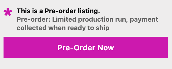
“Ships by March 31st. You won’t be charged until it ships.”
Purchase option label
The selling plan name shown at the buy box
“Deposit-upfront pre-order”
Cart and checkout line
The label that travels with the item
Same selling plan name, rendered by Shopify
Confirmation email
Confirms what they just pre-ordered and restates the terms
“You’ve pre-ordered [PRODUCT]. Ships by March 31st; your card is charged when it ships.”
Any decent pre-order app lets you edit all five, whichever one you use. The rest of this post works through them in that order, starting with the two on your product page, since that’s where the purchase decision happens.
What 1,031 Stores Actually Write
Our dataset covers every store that launched at least one real pre-order listing on PreProduct in the last two years and what they changed in their storefront wording.
Button Text: When to Leave the Default
72.5% of stores keep the button as “Pre-order”. That’s a reasonable default: it’s the clearest call to action for the job, and customers recognise it instantly.
Among the 27.5% that customise, the biggest group isn’t rewording at all; it’s translating. “Jetzt vorbestellen”, “précommander” and “forudbestil” dominate the custom list. If your store sells in a language other than English, localising the button is the first customisation worth making.
The deal in the button: “$50 deposit”, “Pay later”, “Reserve for $1”
Scarcity or queue position: “Reserve spot [X] of 100”
Each of these stays a call to action; it just sharpens the call with real information. “Reserve for $1” tells a hesitant customer the commitment is tiny. A queue-position button tells them the run is capped. If a rewrite doesn’t sharpen the call, keep the default and spend the words in the companion wording instead. The button gets the click; the terms live around it. For placement, colour and layout, see our guide to pre-order button design; this post stays on the words.
Companion Wording: Four Jobs It Can Do
Companion wording is the short message next to the button; in PreProduct it renders just above it, though placement varies by app. It’s where stores put the copy that does the persuading. Across our dataset, nearly every custom message does one of four jobs:
Charge-timing reassurance: “Your payment method will not be charged until the product is ready for shipping.”
Ship-date promise: “Pre-orders made today ship by March 31st.”
Deal statement: “Pay only 50% now, and the balance will be charged when the product ships.”
Scarcity or exclusivity: “This piece is currently sold out, but already in production. Pre-order now to secure yours from the next batch.”
Pick the job that matches your customer’s biggest hesitation. Long lead time? Lead with the ship date. Deferred charge? Lead with “you won’t be charged yet”, because it’s a real conversion advantage most customers don’t expect. High price? State the deposit terms.
One line is usually enough. The strongest pre-order messages in our dataset combine two jobs in one sentence: “Lock in yours with a 30% deposit today, with the remainder charged when they ship.”
Pre-order Message Examples by Payment Type
How you charge changes what your message must say. In our analysis of one million pre-orders, 43.8% of pre-order listings used charge-later and only 25% of pre-orders were charged on day 0. In other words, most pre-orders involve a future charge, and a future charge is exactly the kind of thing customers want spelled out before they commit.
For each pre-order type below: what it is in one sentence, the full breakdown of custom button texts from our 1,031-store sample (shown lowercased, as a % of that type’s customisations, with everything appearing once grouped as one-offs), then pre-order message templates to pair with it. Swap the placeholders for your own dates and terms.
Charge-later Messages
The customer checks out now, their card is saved and you charge when stock is ready; the companion wording’s one essential job is to say that clearly, because it’s both a reassurance and a selling point.
Custom button texts on charge-later listings (360 in sample):
“Ships in [MONTH]. You won’t be charged until your order ships.”
“No charge today. We’ll charge your saved payment method when your item is ready to ship.”
“Reserve now, pay when it ships. Expected dispatch: [DATE].”
You may not need to write this one at all: PreProduct’s charge-later listings say “You won’t be charged until we are ready to ship.” out of the box; customise it to add the date or your brand’s voice.
One caution from the dataset: several stores wrote “you’ll only be charged if we restock”. Only promise conditions you’ll honour, and mirror them in your pre-order policy so the product page and the fine print agree.
Deposit Messages
Deposits split the payment, so the pre-order message must state both halves and when the second one lands.
Custom button texts on deposit listings (156 in sample):
Button text
% of sample
“pre-order”
46.2%
“pre-order now”
2.6%
“vorbestellung”, “précommander”, “pre-order now!”, “pre order now”, “add to cart”, “jetzt vorbestellen”
Deposit listings have the highest share of one-off button texts of any type, because stores put their specific deal in the button: “reserve now ($75 deposit)”, “pre-order for $1”, “order with 50% deposit”. Companion wording to pair with it:
“Pay a [X]% deposit today. We’ll charge the remaining balance when we’re ready to ship.”
“Reserve yours with a $[X] deposit. Balance charged at dispatch, estimated [MONTH].”
“Pay 50% now and 50% on delivery.”
The first is PreProduct’s default deposit wording, with the deposit amount filled in automatically.
If the deposit is non-refundable, say so here and in your policy. A surprise in the fine print is a cancellation later; on average 5.4% of pre-orders get cancelled, and unclear terms are the avoidable share of that.
Charge-upfront Messages
Payment works like a normal order, so the only expectation to manage is the wait: lead with the date and keep it plain.
Custom button texts on charge-upfront listings (232 in sample):
“This item is made to order and ships within [X] weeks.”
“In production now. Orders placed today ship [MONTH].”
Skip the discount instinct: 90.4% of pre-order listings aren’t discounted at all. A firm date sells the wait better than 10% off does.
Capture-only Messages
Capture-only takes the order with no payment attached; you send a payment link when stock is ready, so the message has to explain a deal the customer won’t expect.
Custom button texts on capture-only listings (103 in sample):
Notice “notify me”, “register interest” and “join the waitlist” in there: some stores use capture-only as a waitlist that’s already an order, which converts interest into commitment instead of just an email address. Companion wording to pair with it:
“No payment today. We’ll email you a secure payment link when your order is ready to ship.”
“Register your order now, pay only when it’s ready.”
“Pre-order Yours Today”: Writing Urgency That Doesn’t Overpromise
“Pre-order yours today” is the classic campaign line, and it’s fine as a call-to-action in a caption or announcement. The mistake is manufacturing urgency. Real urgency comes from a limited allocation or a pre-order-only deal, like an early-bird discount, so if you have one, say so with numbers. If you don’t, skip the pressure and let a clear ship date carry the line.
For a pre-order caption or a pre-order announcement post, the same two-question rule applies: what do I get, when do I get it. A workable template:
“[PRODUCT] is available for pre-order now. First batch ships [DATE]. [Terms: pay today / deposit / no charge until it ships]. Pre-order yours today at [LINK].”
Honest urgency lines, patterned on real stores in our dataset:
“Small-batch pre-order, ships by [DATE]”
“10% early-bird discount. Estimated to ship in September 2026.”
“Reserve spot [X] of 100” (a capped run, stated as a number)
Each makes a checkable claim. “Almost gone!” on an uncapped listing isn’t a pre-order message; it’s a trust leak. If you cap your run, put the cap in the copy and enforce it with per-variant limits so the message stays true. When the cap is reached, PreProduct swaps the buy area for a sold-out message (“Pre-orders are sold out” by default, also customisable), so the claim closes itself out honestly.
Where Each Pre-order Message Shows Up: Cart, Checkout and Email
Your product page pre-order message doesn’t follow the order. Once the customer moves to the cart, the words that travel are the purchase option label, the selling plan name that Shopify renders in the cart, at checkout and in the order confirmation email. A pre-order app usually adds its own cart wording on top; PreProduct tags pre-order line items (“Pre-order” by default), shows an estimated shipping line and adds a cart notice (“You have pre-orders to checkout”), all editable.
That makes the label worth more than its default. In our 1,031-store dataset, most stores never change labels like “Deferred charge pre-order”, which is app vocabulary, not customer vocabulary. The best custom example we found: “Pre-order: card charged when your item ships.” Same length, and it answers the payment question everywhere the customer looks after the product page. For how selling plans work under the hood, see our guide to Shopify purchase options or Shopify’s own purchase options documentation.
Two more spots deserve a line of copy:
Mixed carts: 37.9% of stores allow mixed carts of buy-now and pre-order items. The purchase option label already flags which items are pre-orders at cart and checkout, but it might be a good idea to add a line spelling out what ships when: “In-stock items ship today. Pre-order items ship [DATE].”
Confirmation email: restate the ship date and charge timing in the first line. It’s the email customers reread while they wait, and it’s the start of your pre-order email sequence.
In PreProduct, all of this pre-order wording lives in one Front-end Wording screen, with a live preview and separate wording per pre-order type and language. Write the charge-later message once and your deposit listings can still say something different.
Conclusion
A pre-order message is a small-surface, high-stakes writing job. The takeaways from 1,031 stores:
Keep the button a clear call to action; “Pre-order” is the default for a reason. Customise it to translate it or to sharpen the call.
Put the terms in the companion wording: charge timing, ship date, deal or scarcity. One clear line beats three vague ones.
Match the message to the pre-order payment model. Charge-later and deposits need the charge timing spelled out; upfront needs the date.
Rename your purchase option label so the cart, checkout and confirmation email answer the payment question too.
Only make claims you can honour. Real urgency is a capped run or a pre-order-only discount; without one, a clear ship date is enough.
Let the button call the action, then write the two-question answer once and put it on every other surface: companion wording, cart, checkout and email. Your pre-order message will do quiet work for the whole campaign: fewer “when does this ship?” tickets, fewer cancellations, more confident checkouts.
Ready to put custom wording on every pre-order surface? Start taking pre-orders with PreProduct, built to scale and charged and fulfilled when you say so, and set your messaging per listing type and language from one screen.