Your pre-order button is where anticipation turns into action. It’s the moment a visitor decides to trust you with their money for a product that doesn’t exist yet. Most merchants slap “Pre-Order Now” on their product page and call it done. But the more savvy brands treat their pre-order button as a conversion tool worth optimizing.
Your button needs to convert immediately, not after visitors come back a second or third time. The design, copy and surrounding elements all play a role in whether someone clicks or bounces.
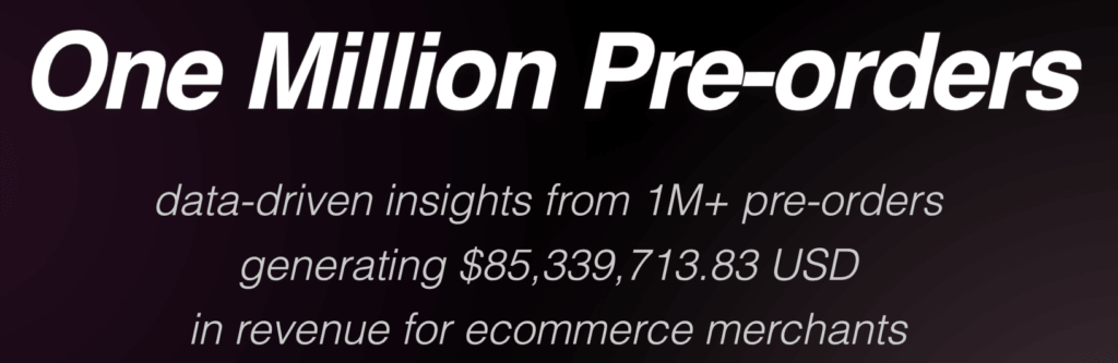
This guide covers what actually works. We’re drawing on data from over $85 million in pre-order revenue processed through PreProduct, plus industry research on conversion optimization. You’ll learn what high-converting pre-order buttons look like, what copy performs best, and how to avoid the mistakes that cost merchants sales.
What Is a Pre-Order Button?
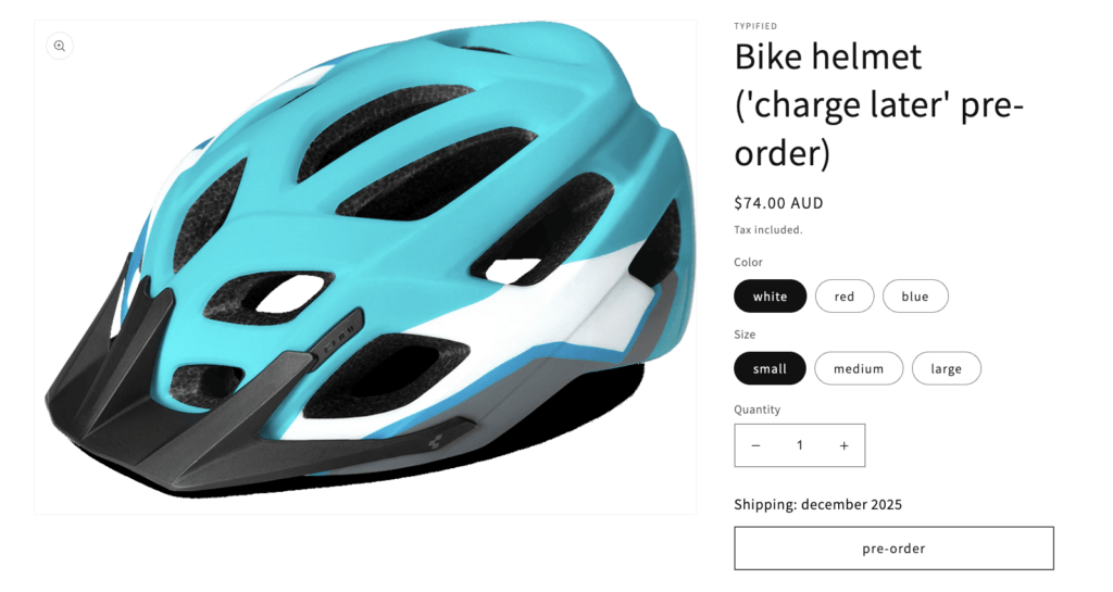
A pre-order button is the call-to-action that allows customers to purchase a product before it’s available to ship. It replaces the standard “Add to Cart” button on product pages when an item is on pre-order, signaling to customers that they’re committing to a product with a delayed fulfillment timeline.
The pre-order button serves three distinct purposes:
- Captures revenue early for products that aren’t yet in stock
- Sets expectations that the product will ship at a later date
- Creates urgency around limited availability or exclusive access
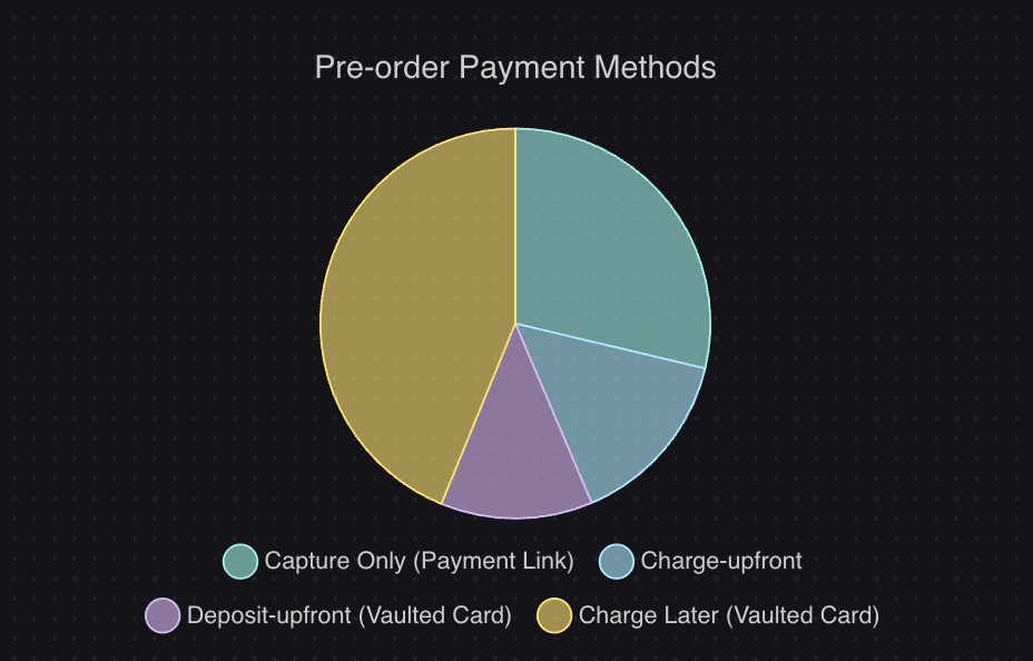
Unlike a “Notify Me” or waitlist signup button, a pre-order button results in a completed transaction. The customer either pays immediately, pays a deposit, or has their payment method saved for a future charge. This is a critical distinction because pre-orders generate actual revenue, while waitlists only capture intent.
Pre-order button vs Add to Cart vs Notify Me
| Button Type | Customer Action | Revenue Generated | Best For |
|---|---|---|---|
| Add to Cart | Purchase in-stock product | Immediate | Products ready to ship |
| Pre-Order | Purchase product before availability | Immediate or deferred | New launches, restocks |
| Notify Me | Email signup for availability alert | None (lead capture only) | Unknown restock dates |
When you have a firm timeline for product availability, a pre-order button is almost always preferable to a “Notify Me” button. You capture revenue instead of just capturing emails.
Why Your Pre-Order Button Design Matters
Pre-orders can convert at significantly higher rates than standard ecommerce purchases because customers arriving at a pre-order page often have stronger purchase intent. They’ve already decided they want the product; the question is whether they’ll commit now or wait.
Your button is the focal point of that experience. Visitors scanning a product page will look at the product image, the price, and then the call-to-action. If your pre-order button doesn’t immediately communicate what’s happening and why they should act now, you lose the conversion.
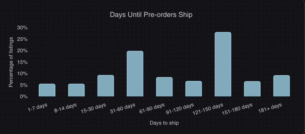
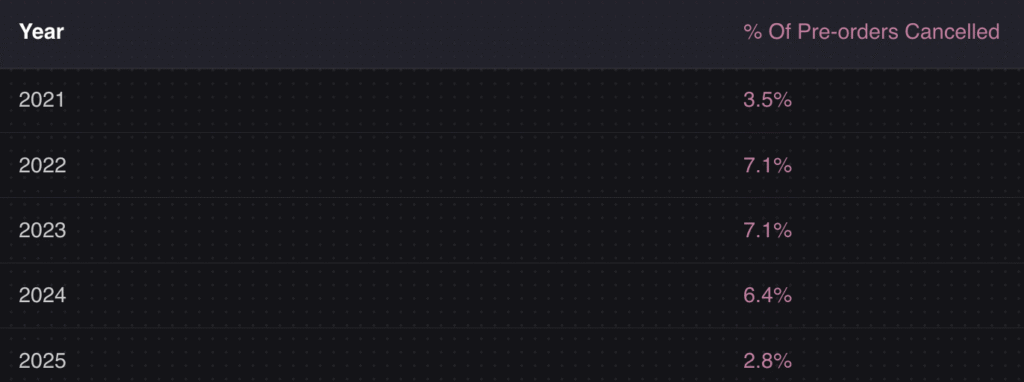
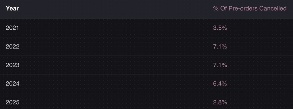
The stakes are high because pre-order customers are your most engaged buyers. They’re willing to pay for something before it exists. According to data from over one million pre-orders, the average cancellation rate is just 5.4%. These are committed customers, but only if you convert them in the first place.
Design details matter more than most merchants realize. Small changes to the button and surrounding elements, like adding countdown timers or limited quantity badges, can meaningfully impact your pre-order revenue.
Pre-Order Button Copy: What Should It Say?
The text on your pre-order button needs to accomplish two things: make the action clear and set the right expectation. Generic button text like “Buy Now” creates confusion when products aren’t ready to ship.
Effective pre-order button text options:
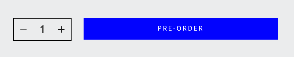
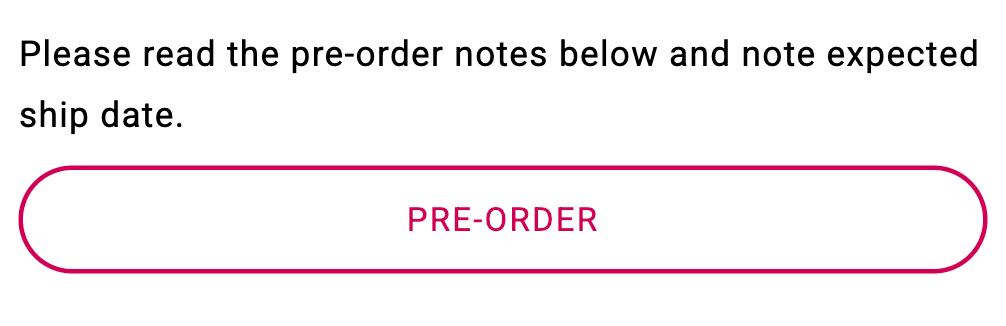
- “Pre-Order Now” – Clear and direct. Works for most situations.
- “Reserve Yours” – Creates exclusivity. Good for limited releases.
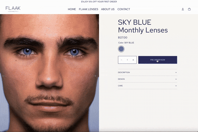
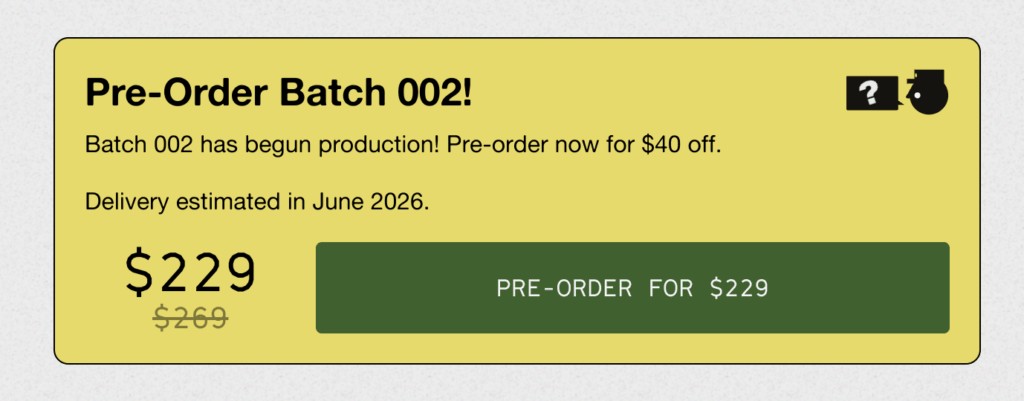
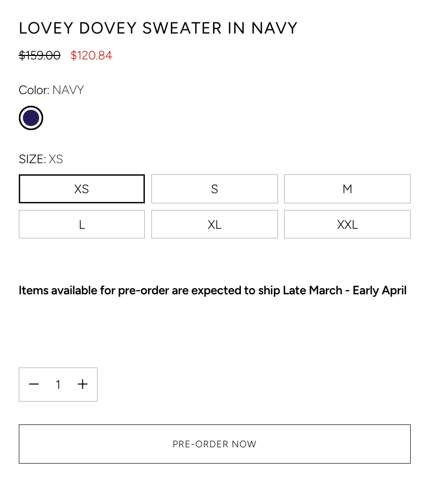
- “Order Now – Ships [Month]” – Includes shipping timeline. Reduces support tickets.
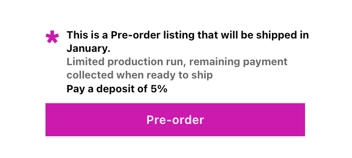
- “Pre-Order – Pay $X Deposit” – Transparent about deposit model. Good for higher-ticket items.
- “Secure Your Order” – Implies scarcity without being pushy.
The best button copy depends on your pre-order payment model. If you’re charging upfront, “Pre-Order Now” works well. If you’re taking a deposit, the button should communicate that. If you’re charging later, consider “Reserve Now – Pay When It Ships.”
Supporting text is just as important as the button itself. The area immediately around your pre-order button should include:
- Expected shipping date or window (e.g., “Ships March 2026” or “Ships in 4-6 weeks”)
- Payment terms if using deposits or charge-later (e.g., “Pay 20% now, rest when shipped”)
- What’s included if there are pre-order bonuses or early-bird pricing
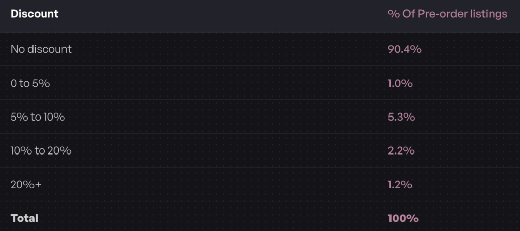
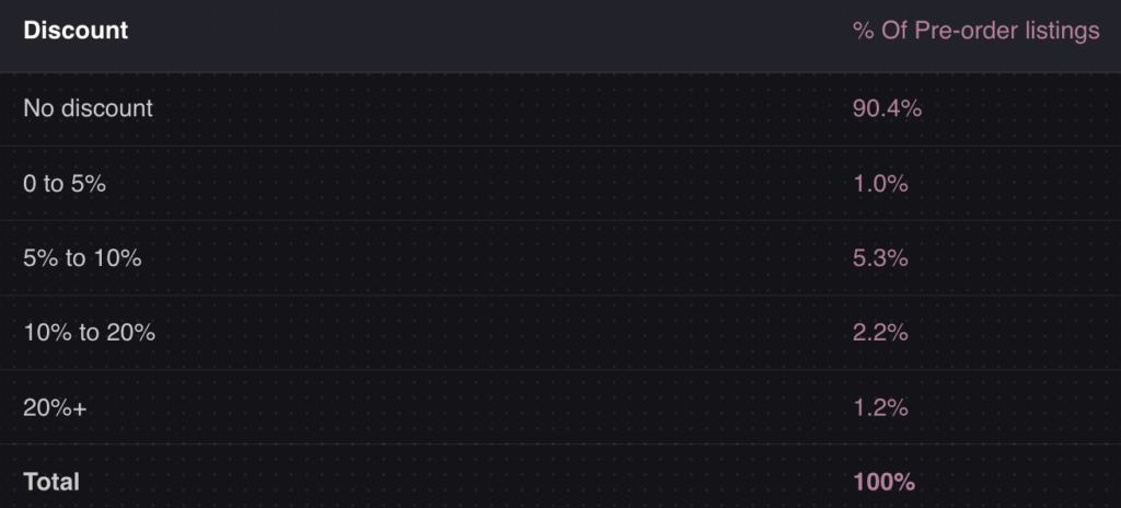
One unexpected finding from our data: 90.4% of pre-orders are not discounted. You don’t need to offer a discount to convert pre-orders. Customers are often willing to pay full price for the guarantee of getting a product when it launches. This means your button copy should focus on the product value and timeline, not necessarily on savings.
What NOT to say on your pre-order button:
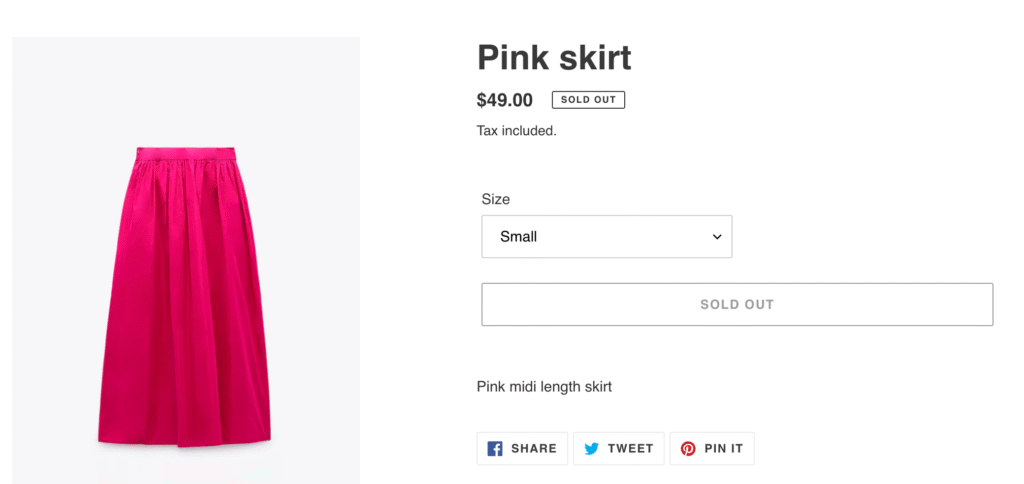
- “Add to Cart” – Misleading when the product won’t ship immediately
- “Buy Now” – Doesn’t set pre-order expectations
- Just “Order” – Too vague, doesn’t communicate timing
- “Coming Soon” – Not actionable, better for a landing page CTA
Your pre-order policy should handle the detailed terms and conditions. The button copy should focus on clarity and action.
Pre-Order Button Design Best Practices
Visual Design Elements
Your pre-order button should stand out from the rest of your product page while still fitting your brand. Here are the key design considerations:
Color and contrast
The button color should create clear visual contrast against your page background. If your site has a white background with black text, a bold color like orange, green, or blue draws attention to the call-to-action. The goal isn’t to be jarring; it’s to make the button the obvious next step.
Many brands use a different color for pre-order buttons than their standard “Add to Cart” buttons. This visual distinction helps reinforce that this is a different type of purchase. Consider using a slightly different shade or adding an icon (like a calendar or clock) to differentiate.
Button size and placement
Pre-order buttons should be at least as large as your standard “Add to Cart” button, if not larger. A small or de-emphasized button signals uncertainty about the offer. Make it prominent.
Placement should follow standard ecommerce conventions. Position the button near the product price, above the fold on desktop, and easily accessible without scrolling on mobile. Customers expect the buy button in a specific location; don’t make them hunt for it.
Sticky and secondary buttons
For longer product pages with detailed descriptions, specs, or image galleries, a single above-the-fold button may not be enough. By the time customers finish reading, the buy button is far out of view.
Sticky buttons solve this on mobile. A fixed button bar at the bottom of the screen stays visible as users scroll through product details. When they’re ready to commit, the button is right there. Most Shopify themes support sticky add-to-cart functionality, and this works with pre-order buttons too.
On desktop, consider adding a secondary pre-order button below the fold. Place it after your product description, after customer reviews, or at the end of a comparison section. Wherever a customer might finish reading and be ready to buy, give them a button. These secondary buttons should use the same text and styling as your primary button for consistency.
Mobile-first considerations
The majority of ecommerce traffic now comes from mobile devices. Your pre-order button design must prioritize mobile users.
On mobile, this means:
- Button should span the full width of the screen or nearly so
- Tap target should be at least 44×44 pixels (Apple’s recommendation)
- Supporting text should be visible without scrolling past the button
- Use a sticky button bar for longer product pages
Test your pre-order page on actual mobile devices. What looks good in a desktop browser preview may not work well with actual thumbs tapping actual screens.
Urgency and Scarcity Elements
The most effective pre-order buttons don’t exist in isolation. They’re surrounded by elements that create urgency and reinforce the value of acting now.
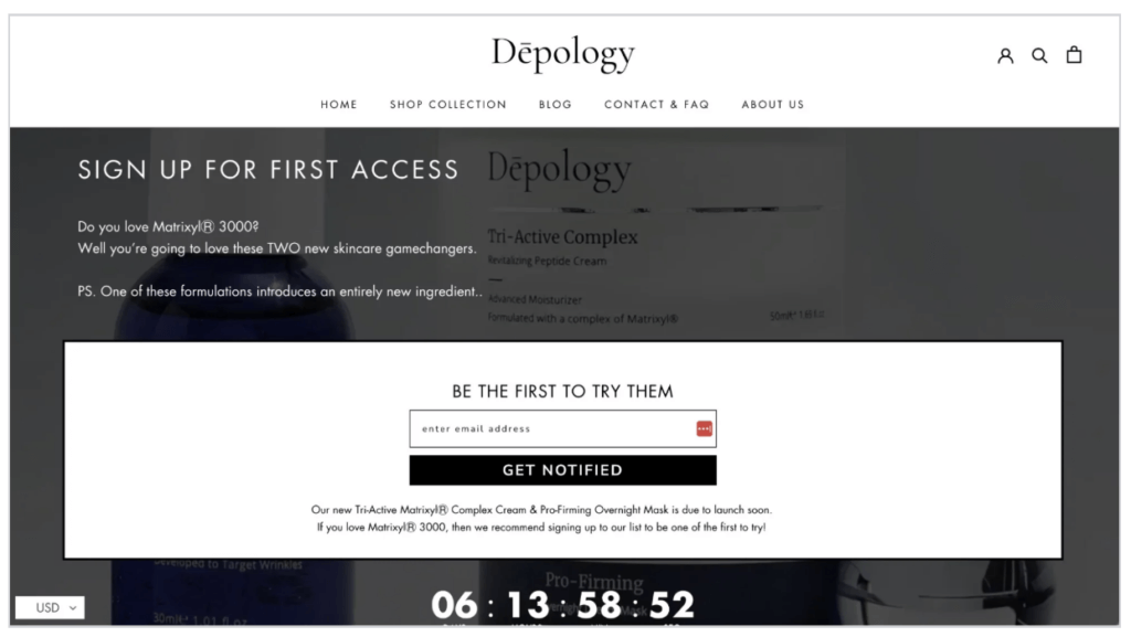
Countdown timers
Countdown timers work because they transform a passive decision (“I’ll think about it”) into an active one (“I need to decide before time runs out”).
Use countdown timers for:
- Early-bird pricing deadlines
- Pre-order windows that close at a specific date
- Limited-time bundles or bonuses
Don’t use fake or evergreen countdown timers. Customers notice, and it damages trust. If the deadline isn’t real, skip the timer.
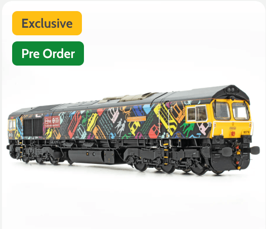
Limited quantity badges
Displaying “Only 50 left” or “Limited to 200 units” creates genuine scarcity that motivates action.
This works particularly well for:
- Limited edition products
- First production runs with genuinely limited inventory
- Products with capacity constraints (like events or services)
If your pre-order has a limit, display it. If it doesn’t, don’t fake it. You can also display the number of pre-orders already placed (social proof) rather than what’s remaining (scarcity).
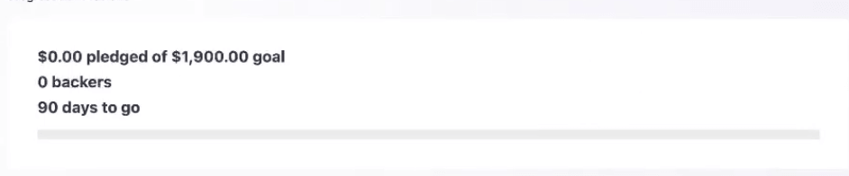
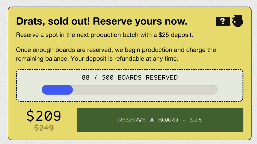
Progress bars
A crowdfunding-style progress bar can be effective for certain types of pre-orders. Showing “75% funded” or “450 of 500 units sold” creates momentum and social proof.
Progress bars work best for:
- Products that need a minimum order quantity to go into production
- Limited runs where you want to show demand
- Campaigns with a funding goal (Kickstarter-style on your own store)
Pre-Order Button Examples From Top Brands
The best way to understand effective pre-order buttons is to see them in action. Here are patterns that work across different industries:
Electronics and tech gadgets
Tech brands often show shipping dates directly in or near the button. “Pre-Order – Ships December 2026” removes ambiguity. They also frequently display expected specifications or features near the CTA to justify the wait.
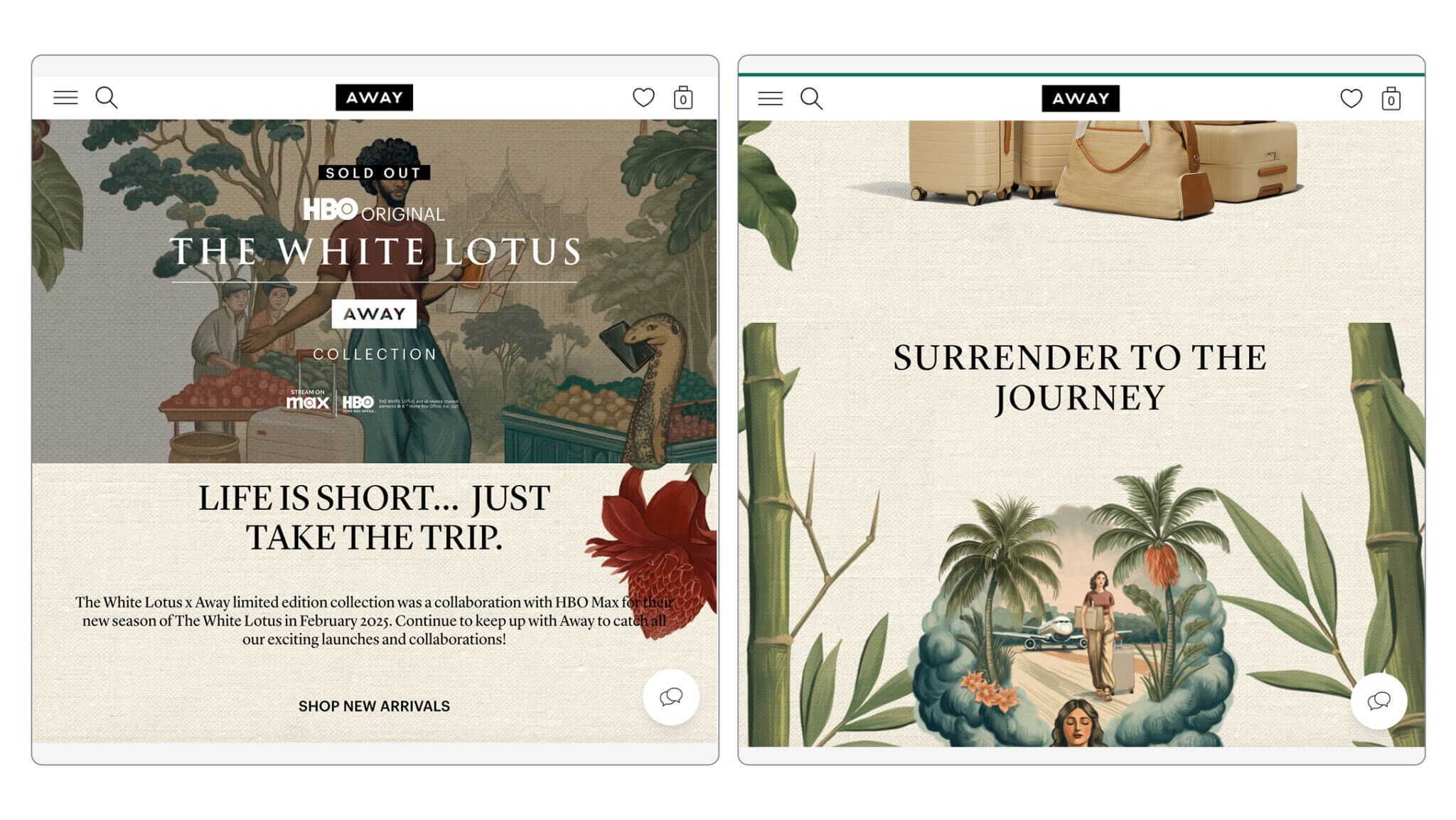
Fashion and apparel
Fashion brands use pre-orders for seasonal collections and limited drops. The most effective buttons emphasize exclusivity (“Reserve Your Piece”) and often include early-bird incentives. Size selection remains visible and functional even on pre-order items.
Home and kitchen
These brands typically have longer lead times and higher price points. Deposit-based pre-orders are common, with button text clearly stating the deposit amount. Supporting copy often includes production and shipping timelines.
Consumables and food
Limited batches and seasonal items work well with pre-orders. Button copy often includes the specific product run (“Spring 2026 Batch”) and expected delivery windows.
For more inspiration on pre-order page design, see our pre-order landing page examples guide.
How to Add a Pre-Order Button on Shopify
There are two primary approaches to adding a pre-order button to your Shopify store: using a dedicated app or customizing your theme manually.
Option 1: Using a Pre-Order App (Recommended)
For most merchants, a Shopify pre-order app is the right choice. Apps handle the complexity of pre-order management, including:
- Automatically replacing “Add to Cart” with “Pre-Order” on selected products
- Managing different payment models (charge upfront, charge later, deposits)
- Setting expected shipping dates and displaying them to customers
- Preventing premature fulfillment with automatic holds
- Sending pre-order specific email communications
When evaluating pre-order apps, look for:
- Button customization – Can you change the text, color, and style to match your brand?
- Payment flexibility – Does it support charge-later and deposits, or only upfront payments?
- Shipping date display – Can customers see when the product will ship?
- Mobile optimization – Does the button and supporting elements work well on mobile?
- Integration with your checkout – Does it work with Shopify’s native checkout?
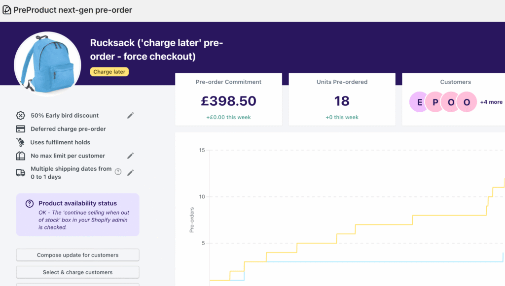
Many pre-order apps, including PreProduct , take over your store’s existing buy button when a product is on pre-order. This means button styling (size, color, shape) is handled through your normal theme editor or page builder. You don’t need to worry about the pre-order button looking different from the rest of your store. The pre-order specific wording and messaging is configured within the app itself.
If you sell internationally, consider adding translations for your button text. “Pre-Order Now” works in English, but you’ll want localized versions for other markets.
PreProduct supports all of these features and integrates natively with Shopify. You can customize the pre-order button text, show deposit amounts, display shipping dates, and use your store’s existing button styles. Check out the complete Shopify pre-order guide for a full walkthrough.
Option 2: Manual Theme Customization
It is possible to add a pre-order button without an app by modifying your Shopify theme code. This involves creating a custom product template that:
- Changes the button text to “Pre-Order”
- Enables “Continue selling when out of stock” for pre-order products
- Adds conditional logic to show pre-order messaging
The manual approach has significant limitations:
- No built-in payment flexibility (you can only charge upfront)
- No automatic fulfillment holds
- No customer portal for pre-order status
- Requires theme code changes that may break with updates
- No dedicated pre-order reporting or management
For brands just testing whether pre-orders work for their products, the manual approach might be a starting point. For anyone serious about running pre-orders at scale, an app is the right investment.
Pre-Order Button Mistakes to Avoid
After processing over a million pre-orders, we’ve seen the mistakes that cost merchants sales. Avoid these common errors:
Hiding the shipping timeline
Customers need to know when they’ll receive their product. Burying the expected ship date in product descriptions or FAQs leads to confusion, support tickets, and cancellations. Put the shipping timeline near the button where customers can’t miss it.

Using standard “Add to Cart” text
When the button says “Add to Cart” or “Buy Now” but the product won’t ship immediately, customers feel misled. This damages trust and increases cancellation requests. Always use button text that clearly indicates a pre-order.
Ignoring mobile users
With most ecommerce traffic coming from mobile, a pre-order button that’s hard to tap or surrounded by cluttered elements loses conversions. Test your pre-order page on actual mobile devices before launching.
Not differentiating from in-stock products
Pre-order products should look visibly different from in-stock items. Use badges, different button colors, or other visual cues. Customers browsing your collection should immediately understand which products are available now versus on pre-order.
Skipping pre-order-specific emails
The button starts the relationship, but pre-order email sequences maintain it. Customers who pre-order need confirmation emails with clear timelines, updates if dates change, and notification when their order ships. The button is just the beginning.
Overcomplicating the checkout
Once someone clicks your pre-order button, the path to completion should be smooth. Don’t add unnecessary upsells, pop-ups, or distractions. Pre-order customers have already decided; let them finish the transaction.
Key Takeaways
Your pre-order button is more than a clickable element. It’s the conversion point where product interest becomes revenue. Getting it right requires attention to copy, design, and the supporting elements around it.
Remember these principles:
- Use clear button text that sets pre-order expectations (“Pre-Order Now” not “Buy Now”)
- Display shipping timelines prominently near the button
- Design for mobile first; most of your orders will come from phones
- Consider using urgency elements like countdown timers and quantity limits when genuine
- Test button copy and design; small changes can significantly impact conversions
Most pre-orders don’t need discounts. 90.4% of pre-orders in our data are sold at full price. Focus on communicating value and building trust rather than racing to the bottom on price.
If you’re ready to start taking pre-orders on Shopify, the PreProduct app handles the technical complexity so you can focus on your product launch. For merchants who prefer to start manually, our how to do pre-orders on Shopify guide walks through every step.
Pre-sell With PreProduct
7 day free trial with all plans